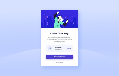
Not Found
Not Found
Not Found
Not Found
Not Found
Not Found
Not Found
Not Found
Not Found
Not Found
Not Found
Not Found
Not Found
Not Found
Not Found
Not Found
Not Found
Not Found
Not Found
Not Found

Submitted

Responsive order summary

@Leticiafbm

Desktop design screenshot for the Order summary component coding challenge

This is a solution for...

  • HTML
  • CSS
1newbie
View challenge

Design comparison


SolutionDesign

Solution retrospective


What are you most proud of, and what would you do differently next time?

I used grid to make the part with the annual plan and I thought it was cool but theres probably an easier way to do it

What challenges did you encounter, and how did you overcome them?

To make it responsive

What specific areas of your project would you like help with?

The image inst loading i need help with that

Community feedback

@R3ygoski

Posted

Olá novamente Letícia, seu projeto ficou muito bom, parabéns.

Notei que a sua imagem não está carregando, isso porque essa tag está com o src errado: <img class="img" src="/images/illustration-hero.svg" alt="image">, o correto é que antes da barra de /images tenha um ponto, assim: ./images, ou você poderia apenas remover a barra também, deixando images/... que funcionaria.

Sobre a responsividade, o card fica quebrado quando chega a 320px, como por exemplo aquela div onde fica a imagem de música está passando do tamanho do card, isso devido ao width estar em px, isso faz com que ela tenha um tamanho fixo e não se adapte ao tamanho do elemento pai, uma forma de corrigir isso seria usar por exemplo width:90%; e caso você pretenda fazer isso, também terá que alterar a sua grid. Isso também vale para o botão, que você poderia colocar também para ele ter uma largura relativa (%), mas aí teria que reajustar o padding. E o mesmo também vale para o txt-2, ele também não iria quebrar em uma largura relativa. Testei width: 90%; em todos, e todos ficaram sem quebrar.

Obs.: Essa parte que falei das quebras, isso está ocorrendo na parte da @media.

Uma dica que eu dou é de sempre que for fazer projetos responsivos, começar a fazer seguindo Mobile-First Workflow, que dessa forma você começa fazendo para telas menores (320px ou 375px), e depois só ir adaptando para telas maiores, o que fica mais intuitivo e talvez até mais fácil.

De resto é isso, parabéns pelo seu projeto, ele está muito bem feito, parabéns. Caso eu não tenha explicado algo de forma clara, por favor comente aqui embaixo que tentarei ajudar da melhor forma.

Marked as helpful

1

@kemenyfa-szu

Posted

Hello @Leticiafbm!

Congratulations on finishing this frontendmentor challenge! Nice work!

The image isn't loading because you missed a dot in the src attribute. You need this: src="./images/..."

Marked as helpful

0

Please log in to post a comment

Log in with GitHub
Discord logo

Join our Discord community

Join thousands of Frontend Mentor community members taking the challenges, sharing resources, helping each other, and chatting about all things front-end!

Join our Discord