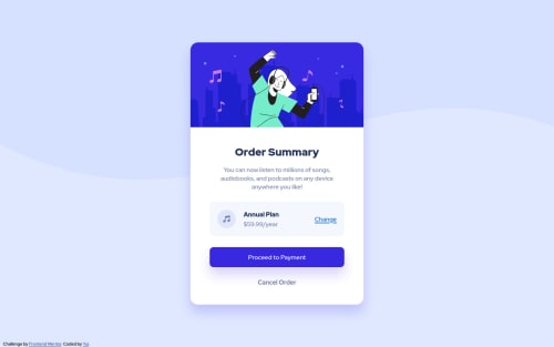
Responsive order summery component using Flexbox

Solution retrospective
My main goal for this challenge was to use Flexbox but I feel I didn't make good use of it. So if you find someplace where I could use Flexbox instead of what I am using right now, I'd be happy to hear that! Otherwise, I'd appreciate your feedback/advice :)
Please log in to post a comment
Log in with GitHubCommunity feedback
- @ericsalvi
Hey Yui,
Great job with your first submission!
I think your flex works great for the pricing section where you have it now. I don't think there really is a need for anything else to have flex unless on mobile it needed to go from column to row. But for this component that is not the case.
A suggestion for future flex usage, instead of adding a
padding-left: 20px
to the item-2 class, you could just usegap: 20px
set on the flex container.I'd also try to name your classes according to what the content is. Reading the code, item-1 and item-2 don't really help the developer to fully understand what each section is. I like to implement the BEM naming convention, not required, just helpful.
One last thing is that the 2 buttons you have are not selectable via the keyboard. It looks like you just have 2 divs styled to appear like buttons. I'd check out https://a11y-101.com/design/button-vs-link for future submissions on buttons.
Also to piggyback on what Philemon was saying, each submission on this platform generates a report for any invalid accessibility or HTML. Check out your report It is good practice to try and fix them. I use the
axe DevTools
extension in Chrome before I submit.Can't wait to see more of your work!
Marked as helpful - @correlucas
👾Hello Yui, congratulations for your solution!
I saw your old solution and I've some suggestion to you for improve it:
To make the card fully responsive and keep it contracting when the screen scales you need to fix the container
width
and also the image, to start you need to replacewidth: 450px;
withmax-width: 450px;
you'll see how changes after you do that, the card starts to resize.content { margin: 0px auto; text-align: center; background-color: #fff; max-width: 450px; height: 680px; position: absolute; top: 50%; left: 50%; transform: translate(-50%, -50%); border-radius: 20px; box-shadow: rgb(56 41 224 / 20%) 0px 20px 30px; }
To make your image fully responsive add
display: block
andmax-width: 100%
andobject-fit: cover
to make the image auto-crop when resizing inside the column:img { object-fit: cover; display: block; border-radius: 20px 20px 0 0; max-width: 100%; } .content-image { object-fit: cover; display: block; border-radius: 20px 20px 0 0; max-width: 100%; }
👋 I hope this helps you and happy coding!
- @maiaflow
I like how you styled your attribution credit on the bottom left. Mine was confusing my vertical alignment so I just commented it out LOL. also, I like how you organized your CSS with commented out headings. I'm gonna try that next time! Looking forward to seeing your next submission!
- @bahati7
Hello Yui,
congratulations for this challenge:) just few tips to improve the code:
- add "alt" attributes on img tags for accessibilty;
- wrap your code in a "main" tag instead of div class="content">
- use relative units like %, rem to specify the width of the ".content" class, after that you can add "max-width: 450px";
- you are not obliged to specify the height of the ".content" class
once again good job!!!
Join our Discord community
Join thousands of Frontend Mentor community members taking the challenges, sharing resources, helping each other, and chatting about all things front-end!
Join our Discord