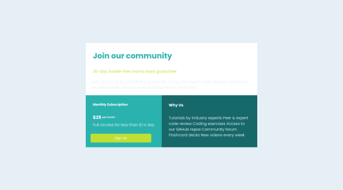
responsive page

Solution retrospective
i'm a Beginner iam still learning please if you have any comments on how i can improve my code let me know
Please log in to post a comment
Log in with GitHubCommunity feedback
- @Ennry
Hello and Great job in completing the challenge!
I have a few suggestions to make your code better:
To make the grid work better you can set a div to
display: grid;with 3 divs inside. Each div should have their own content inside. You can set thegrid-template-columns: 1fr 1fr;orrepeat(2, 1fr);to have a grid with 2 column option and change each divgrid-columnandgrid-row.To make the grid responsive on mobile you can set for example
@media (max-width: 425px)and change thegrid-columns-template: 1frmeans one column for mobile and change each divgrid-columnandgrid-rowfor the mobile width.You can set your grid to the center of the viewport while setting the body
min-height: 100vhanddisplay: flex;withjustify-content: centeralign-items: center;You can look at my solution for examples.You did a great job for a beginner, keep at it! Happy coding!

Join our Discord community
Join thousands of Frontend Mentor community members taking the challenges, sharing resources, helping each other, and chatting about all things front-end!
Join our Discord