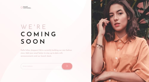
Responsive Page built with - HTML5, CSS3, Floats, SASS, BEM, JS

Solution retrospective
Hi front end mentor community :),
This is my second project and here is what I have to say about it. The challenge was straight forward but there were definitely some moments of frustration. One of those moment's was working with the svg element inline. Getting the brand image to match perfectly was a nightmare. I couldn't for the live of me get it to work for both the mobile and desktop designs.
So i'd like to know what is everyone's preferred and painless method for working with svgs?
Another minor moment of frustration was trying to get the background shorthand syntax to work. I checked MDN and followed their guidelines but no matter what I did the background kept on repeating. I had added no-repeat but it kept repeating anyway. Any recommendations to solve the matter would be appreciated.
Discovered a bug on the site when it was accessed from my phone. The outline of the input remains rectangular even though the actual input element is rounded. Anyone know why?
Finally, I know its a small project but should I get into the habit of adding comments and how many comments can you add before it becomes comment overkill?
As always happy coding everyone :)
Please log in to post a comment
Log in with GitHubCommunity feedback
No feedback yet. Be the first to give feedback on James Le-Goff's solution.
Join our Discord community
Join thousands of Frontend Mentor community members taking the challenges, sharing resources, helping each other, and chatting about all things front-end!
Join our Discord