


Design comparison

Solution retrospective
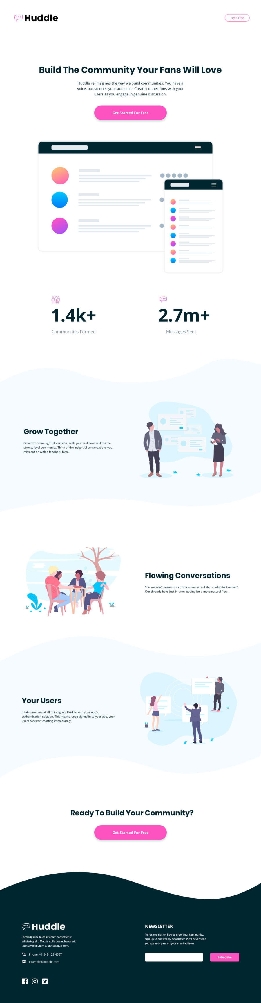
Hi everyone. This is my first time to challenge the whole page, it's a lot more harder than I thought. Good to finish but I know my code is not good and sooooo messy. Any feedback or suggestion is more than appreciated.
Below are some situation I had,
-
how to make
<input[type="text"]>in footer section same height with the button beside it automatically? Now I just use padding to do it. -
the image at content section, flowing conversations area, shrink a lot when I make the window smaller but it doesn't happend on the other two. Is there a way to set the image and text area same width? I tried to set them
flex: 1 1 0;but doesn't work. -
the area above footer, "Ready to Build Your Community?"area used to affected by the
gap: 6rem;I set onclass="item". I tried to overwrite it in media query but doesn't work. At last I just removeclass="item"to fix it.
Thanks!!!
Community feedback
Please log in to post a comment
Log in with GitHub
Join our Discord community
Join thousands of Frontend Mentor community members taking the challenges, sharing resources, helping each other, and chatting about all things front-end!
Join our Discord