Not Found
Not Found
Not Found
Not Found
Not Found
Not Found
Not Found
Not Found
Not Found
Not Found
Not Found
Not Found
Not Found
Not Found
Not Found
Not Found
Not Found
Not Found
Not Found
Not Found

Submitted

Responsive page

uyiplay44 60

@uyiplay44

Desktop design screenshot for the QR code component coding challenge

This is a solution for...

  • HTML
  • CSS
1newbie
View challenge

Design comparison


SolutionDesign

Solution retrospective


I find it difficult to centralize the image inside the white border. I'm unsure if the project was put at the center of the entire body and the media query. I don't have any questions but the best practice is to keep accepting more challenges to enable you get a proper understand of any kind of task.

Community feedback

Azhar 600

@azhar1038

Posted

Hi uyiplay44,

Nice work there!

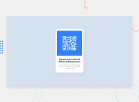
To make your card appear at center you can use a wrapper of height 100vh and width 100vw, then use flex like this:

.wrapper {
  display: flex;
  height: 100vh;
  width: 100vw
  align-items: center;
  justify-content: center;
}

You may use grid with single column too if you want.

Other than that, I noticed you used just one p tag for the whole text. This is not good, try using an h1 or preferably h2 tag for heading and p for other.

0

uyiplay44 60

@uyiplay44

Posted

@azhar1038 Thank you for the comment, I really appreciate I believe I will improve more on tasks here. But I used the p tag and I span it also to get a different look from the top text and bottom text as well. I have learnt something I will try and carry out the project again to get a perfect score.

1
Shiva 670

@shivaprakash-sudo

Posted

Hello uyiplay44,

Congrats on completing your first challenge!

Regarding the centering of the image, you don't need to centre it, just use max-width: 100%; for the image, other than that you don't need to use any other sizing properties for it. Try putting some padding inside the card, that'll make it a little bit better looking, like the design.

I have few suggestions:

  • There is only one card here, so there is no need of grid here.
  • You don't need to apply the properties width, padding and margin to the body, instead you can apply it for the container inside it.
  • Try to code the design for mobile screens first and then go for bigger screens using media queries(using min-width property).

Happy coding and good luck to your next projects!

0

uyiplay44 60

@uyiplay44

Posted

@shivaprakash-sudo Thank you so much it really encourages me to learn more and become a perfect learner soon. But I will keep embarking on any project here.

1
Shiva 670

@shivaprakash-sudo

Posted

Good luck!

0

Please log in to post a comment

Log in with GitHub
Discord logo

Join our Discord community

Join thousands of Frontend Mentor community members taking the challenges, sharing resources, helping each other, and chatting about all things front-end!

Join our Discord