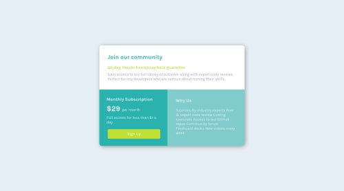
Submitted almost 4 years agoA solution to the Single price grid component challenge
Responsive page using a bit of flexbox and paddings.

@Darshan-Pandya10
Solution retrospective
Any feedback will be appreciated :)
Code
Please log in to post a comment
Log in with GitHubCommunity feedback
- @Manojraj07
hey Darshan!
Nice work. I guess making below changes will take it one step closer to original layout.
1). Try using list for 'Why us' section. Currently it's using <p> element. 2). 'per month' text can be centered vertically & it's color can be downgraded.
Happy coding!

Join our Discord community
Join thousands of Frontend Mentor community members taking the challenges, sharing resources, helping each other, and chatting about all things front-end!
Join our Discord