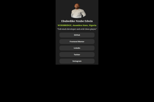
Submitted 11 months agoA solution to the Social links profile challenge
Responsive page using CSS and HTML

@Zubby126
Solution retrospective
What are you most proud of, and what would you do differently next time?
That I am getting to learn my Media query and making a little progress
What challenges did you encounter, and how did you overcome them?Encountered problem of placing my container so as to adjust during media query
What specific areas of your project would you like help with?Media Query, I need help on media query for mobile responsiveness
Code
Please log in to post a comment
Log in with GitHubCommunity feedback
- P@MikDra1
I encourage you to use this technique to make the card responsive with ease:
.card {
width: 90%;
max-width: 600px;
}
On the smaller screens card will be 90% of the parent (here body), but as soon as the card will be 600px it will lock with this size.
Also to put the card in the center I advise you to use this code snippet:
.container {
display: grid;
place-items: center;
}
Hope you found this comment helpful 💗💗💗
Good job and keep going 😁😊😉
Marked as helpful

Join our Discord community
Join thousands of Frontend Mentor community members taking the challenges, sharing resources, helping each other, and chatting about all things front-end!
Join our Discord