Submitted almost 2 years agoA solution to the QR code component challenge
Responsive page using CSS grid

@danielaser
Code
Please log in to post a comment
Log in with GitHubCommunity feedback
- @kanishkasubash
Hi, Daniela👋. Congratulations on successfully completing the challenge! 🎉
Your solution looks great, and you've done a fantastic job overall! However, here are some small suggestions after taking a look at your code to make it even better that might interest you:
HTML:
- The
<main>element should wrap around the entire component. Using the<header>,<main>,<footer>elements provide structural clarity, accessibility improvements, SEO benefits, and facilitates responsive design. It helps you create well-organized, maintainable, and user-friendly web pages. - It's important to note that the
alttext should be descriptive but concise, conveying the essential information without being overly long. It should provide a meaningful summary of the image's content and purpose. (Eg: alt="QR Code for frontendmentor.io") - Starting with
<h1>and working your way down the heading levels<h2>, <h3>etc. helps ensure that your document has a clear and consistent hierarchy. Source
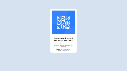
<body>
    <main class="container">
        <div class="card">
            <img class="card-image" src="images/image-qr-code.png" alt="QR Code for frontendmentor.io">
            <h1 class="card-heading">Improve your front-end skills by building projects</h1>
            <p class="card-description">Scan the QR code to visit Frontend Mentor and take your coding skills to the
                next level</p>
        </div>
    </main>
    <footer><div class="attribution">...</div></footer>
</body>
CSS:
- You should use a CSS reset. A CSS reset is a set of CSS rules that are applied to a webpage in order to remove the default styling of different browsers.
CSS resets that are widely used:
"My Custom CSS Reset" by JoshWComeau
- Using advanced layout features like Flexbox and Grid can provide more efficient and flexible ways to create complex layouts and manage spacing between elements. Flexbox is generally the best modern layout method to use for flexible responsive structures. Grid would be used for content where you want better control of their layout using columns and rows. This article explains it quite well Link as well as this video by Kevin Powell which demonstrates in practice when you would use which Link (NB. You can also combine them in an application, it all depends on the use-case)
- If you want to build the most-accessible product possible, you need to use both pixels and ems/rems. It's not an either/or situation. There are circumstances where rems are more accessible, and other circumstances where pixels are more accessible. Link
- To center the content properly and make your layout more flexible, consider using
min-height: 100vh. This way, your content will adjust to fit the screen height regardless of the device. - You can use the
max-width,marginandpaddingto control the width and position of your elements. For example:
.container {
    min-height: 100vh;
    display: flex;
    align-items: center;
    justify-content: center;
}

.card {
    max-width: 20rem;
    background-color: hsl(0, 0%, 100%);
    border-radius: 0.938rem;
    text-align: center;
}

.card-image {
    width: 90%;
    border-radius: 0.625rem;
    margin: 5%;
}

.card-heading {
    margin: 2% 5%;
    padding: 0 5%;
}

.card-description {
    margin: 5% 5% 12%;
    padding: 0 5%;
}
I hope you find this helpful! 😄 Keep up the great work! 👍
🖥️Happy coding!
Marked as helpful - The

Join our Discord community
Join thousands of Frontend Mentor community members taking the challenges, sharing resources, helping each other, and chatting about all things front-end!
Join our Discord