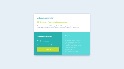
Responsive page using Flexbox properties

Solution retrospective
I'm lerning about flexbox these days, so I choosed to apply this properties here. The mobile version was not exact the same as the example, I set the width and the height in% to do the trick, but I'm not sure if it's the best way. If anyone could show me a better way, I'd appreciate.
Please log in to post a comment
Log in with GitHubCommunity feedback
- @MordenWebDev
you are specifying height for the grid so it will not be able to grow according to the content. if you remove the height from grid class it will fix the issue . remove height form grid class in media query also it will fix the issue for mobile. it will be responsive.
Join our Discord community
Join thousands of Frontend Mentor community members taking the challenges, sharing resources, helping each other, and chatting about all things front-end!
Join our Discord