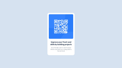
Responsive page using Flexbox to adapt to all screen sizes.

Solution retrospective
What I am most proud of is having finished this project, despite its simplicity. I like how simple things can be challenging.
For now, I wouldn’t do anything differently.
What challenges did you encounter, and how did you overcome them?The biggest challenge I encountered was making it responsive, but after much research, I found some ways to do that.
What specific areas of your project would you like help with?I would like you to analyze my HTML and CSS code and give me feedback and tips on how I can improve my code and further enhance my skills. This would help me a lot, and I would be very happy with everyone's contribution.
Please log in to post a comment
Log in with GitHubCommunity feedback
- @Tripouille
Hi Flavio !
Congratulations! Adding height and width attributes to the img tag can help prevent layout shifts. Additionally, I suggest creating CSS variables for colors to enhance maintainability and readability. Apart from that, great work!
- @xiNeRoar
There are indeed a very slight shadow around the card in the original image, next time you might consider code that as well


Join our Discord community
Join thousands of Frontend Mentor community members taking the challenges, sharing resources, helping each other, and chatting about all things front-end!
Join our Discord