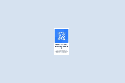
Submitted 3 months agoA solution to the QR code component challenge
responsive page using html, css and media query

@Gospelz
Solution retrospective
What are you most proud of, and what would you do differently next time?
im happy i could complete the project with my little understanding of
What challenges did you encounter, and how did you overcome them?positioning my elements and using the media query
What specific areas of your project would you like help with?how to use flex property effectively and how to make my webpages more responsive.
Code
Loading...
Please log in to post a comment
Log in with GitHubCommunity feedback
- @binyamyd
Its nicely done but i think the width of the container should increase just to make the header and the paragraph a bit wider and also to increase the the container size according to the image provided.

Join our Discord community
Join thousands of Frontend Mentor community members taking the challenges, sharing resources, helping each other, and chatting about all things front-end!
Join our Discord