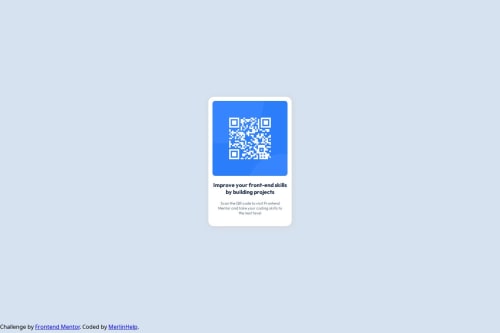
Responsive page utilizing CSS Media Queries & Auto Values

Solution retrospective
Starting
I am definitely most proud of starting, because at first it looked daunting not knowing what kind of HTML elements I would use. However, I am proud that I started and stuck through.
What challenges did you encounter, and how did you overcome them?A lot
At first I struggled picking the right HTML element, as well as centering divs and imgs (I thought centering a div was a meme... haha...). I especially struggled through getting a more responsive site for different view ports (It still is not good).
What specific areas of your project would you like help with?Requested Feedback
Is there a more standard or conventional way to do sizes for images, boxes, divs, fonts, or is it really just experimentation for the numbers. What kind of sizes should I be using? When would you ever use px or em over vh/vw/rem/%?
Also, is there a better way to make things responsive? Also, is the fastest way to understand the possible values of a CSS properties via Mozilla documentation? I feel like those docs had the most in-depth explanation, examples, and possible values for each property.
Finally, could I have done anything more efficiently and what is the proper way I should have made Ids/classes and referenced them in my CSS.
Please log in to post a comment
Log in with GitHubCommunity feedback
- @mylothedev
Yes, there are common conventions, though some experimentation is often involved too. For fonts, most developers use rem because it scales based on the root HTML font size, which is good for accessibility. For general layout elements like boxes or containers, units like %, vw, and vh are more common since they respond to the size of the viewport or parent element. Absolute units like px are best for precise things like borders or small icons, but not great for responsive design. You would use px when you need pixel-perfect accuracy, like with borders or exact spacing that shouldn’t scale. em is useful when you want an element to scale based on the font size of its parent, though it can get confusing when nested. rem is preferred for consistent scaling across your whole site, since it's relative to the root font size. vh and vw are great for full-screen sections or elements that need to adapt to screen size. % is very useful for responsive widths, padding, or heights inside flexible containers. The best way is to combine flexible units (%, rem, vw, vh) with layout systems like Flexbox or CSS Grid. For text sizes, you can use clamp() to make them scale smoothly between a minimum and maximum size. Media queries are also essential—they allow you to change styles at specific screen widths, like hiding a sidebar on small screens. Using these tools together creates a layout that works on any device size. Yes, MDN is the most trusted and comprehensive resource for CSS. It not only explains what each property does but also shows examples, syntax rules, and browser support. It’s a great place to learn quickly and deeply. Searching something like “MDN flexbox align-items” usually brings up the exact info you need. Yes, there are better ways to structure your CSS using best practices. You should only use IDs for elements that appear once on a page, like a site header or a specific form. For styling multiple elements, always use classes. Following a naming convention like BEM (Block Element Modifier) can make your code easier to manage and scale. For example, a card title could be called card__title, and a highlighted version of the card might use card--featured. This makes your CSS easier to understand and avoids conflicts.
Marked as helpful - @Adelali4600
it is perfect.


Join our Discord community
Join thousands of Frontend Mentor community members taking the challenges, sharing resources, helping each other, and chatting about all things front-end!
Join our Discord