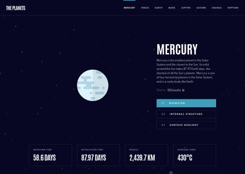
Submitted almost 4 years agoA solution to the Planets fact site challenge
Responsive planet fact site built with React/React-router

@NinjaInShade
Solution retrospective
There were some instances were I did not follow DRY principle, and set small stylings for each planet. Any way I could improve this CSS?
One example is at tablet view each planet image had a different max width in the design file, and I couldn't figure any uniform way to set that max width like % based, so I did it somewhat repeatably.
Code
Couldn’t fetch repository
Please log in to post a comment
Log in with GitHubCommunity feedback
No feedback yet. Be the first to give feedback on Leon Michalak's solution.
Join our Discord community
Join thousands of Frontend Mentor community members taking the challenges, sharing resources, helping each other, and chatting about all things front-end!
Join our Discord