Submitted almost 2 years agoA solution to the Planets fact site challenge
Responsive planets facts using next js and tailwind
next, react, tailwind-css, typescript

@Newpoki
Solution retrospective
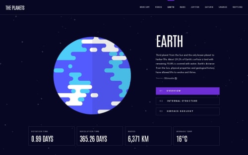
Hello ! This is my solution on the planets fact exercise !
As data is not going to change, I chose nextJS to build the website, with static routes. This is a bit overkill, but I wanted to play with nextJS to get better with it. For the styling, I use tailwind CSS for the same reason, I want to step up on it
Also, I added few details, such as an infinite scrolling background image, transitions, and a "parallax" effect on the planet (only on device with mouce)
Do not hesitate to ask some question
Code
Please log in to post a comment
Log in with GitHubCommunity feedback
No feedback yet. Be the first to give feedback on Jason Savelli's solution.
Join our Discord community
Join thousands of Frontend Mentor community members taking the challenges, sharing resources, helping each other, and chatting about all things front-end!
Join our Discord