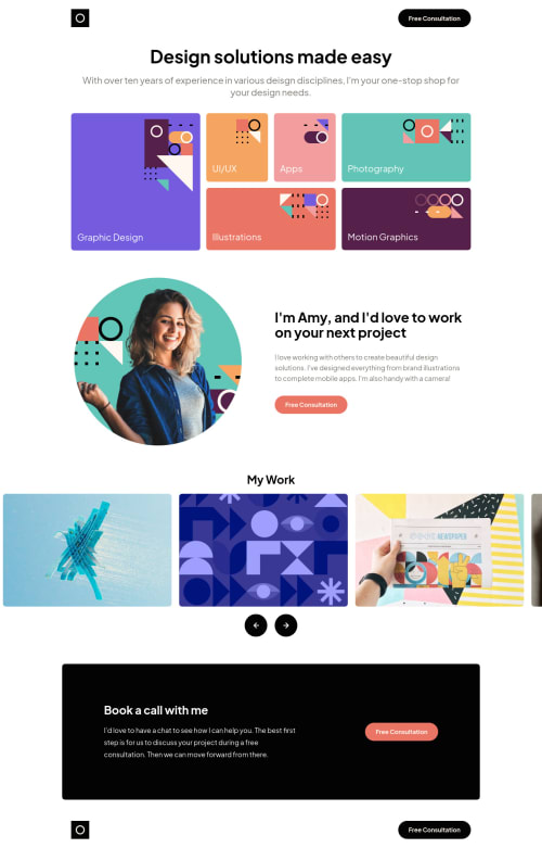
Responsive Portfolio using TailwindCSS and Vanilla JS

Solution retrospective
Any feedback would be greatly appreciated! I am ok with the carousel functionality on the mobile and tablet screens but the desktop version feels a bit off. I think with more images added, it would look cleaner but I wanted to stick with the challenge design and mockup.
Please log in to post a comment
Log in with GitHubCommunity feedback
- @kwalker3000
Hello, Jose.
Nice solution.
Regarding the carousel, I do feel like there is a bit too much white space, and I see you are creating the effect by shifting the <ul> container over with each click. What if instead of shifting the <ul> you simply switched out images? This shouldn't require much except a little javascript and a loop.
I also see you have a couple of accessibility issues regarding your carousel buttons. I usually fix this by adding an aria-label, but there are other ways. Here is a nice article on accessible icon buttons
The site's responsive behavior is great so is the overall spacing.
Hope this was helpful. Wish you great success on your journey.
Marked as helpful

Join our Discord community
Join thousands of Frontend Mentor community members taking the challenges, sharing resources, helping each other, and chatting about all things front-end!
Join our Discord