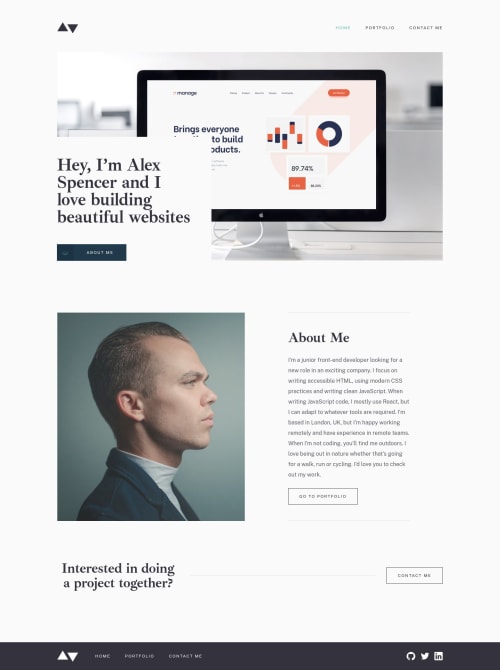
Responsive portfolio website in React/Typescript

Solution retrospective
Hey everyone, happy to submit my solution to this challenge,
First of all I've got an issue in my code : the "about me" button of the homepage is not behaving like it should be on mobile version. The background color of the button should turn white after clicking, and turn back to blue after losing the focus. Weird thing is that everything is working perfectly in my chrome inspector (on the mobile breakpoint) but not on my phone. In any case I would like to know if anyone of you have a better solution concerning the switching of the button color on the hover, especially for the arrows which are in SVG format.
If you go to the component "ProjectDetails" in my code you'll notice that I'm making a lot of import, and I would like to know if there is a solution to make all of these imports in a separated file.
Concerning the responsive part of the project, I'm puting fixed size for the different elements of my pages, and these fixed sized switches to other fixed sizes after passing a breakpoint. As they are fixed sizes they are not adapting to the screensize while being inside the same breakpoint. Should I put % instead of fixed width or is it correct to put fixed sizes ?
I'm planing on adding a feature on the form. After submitting the form, the user's mail application will open will all the data automatically field, or a gmail new tab will open in the same fashion. Have any clue how to do it (without package if possible)
For the rest I'm interested in any advices that you could give me reviewing my code, I know that there is a lot to improve.
Thanks in advance !
Please log in to post a comment
Log in with GitHubCommunity feedback
No feedback yet. Be the first to give feedback on Hervé's solution.
Join our Discord community
Join thousands of Frontend Mentor community members taking the challenges, sharing resources, helping each other, and chatting about all things front-end!
Join our Discord