Responsive price card woith CSS Grid

Solution retrospective
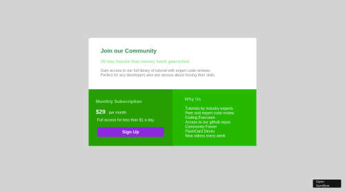
Hi there, this is my first attempt with html and css,I haven't applied the media queries yet and the color scheme is a little different as well. but still hoping for some reviews:)
Please log in to post a comment
Log in with GitHubCommunity feedback
- @steventoben
I highly recommend not changing colors unless you know what you're doing, the contrast ratio makes the text illegible and basically every piece of text is firing off accessibility warnings. There's quite a lot going on here but basically you should use better html semantics and also use class names much better. You have a header (that's not actually a header) named top, which really has no meaning at all. Also I wouldn't style entire selectors like you're styling h3 and h1 and stuff without using class names so you're changing it for everything in the document. You're also using h3 a ton I'm not sure why, you should use h1-h6 starting with h1 as highest importance and h6 as lowest. Since you're using grid on this theres really no reason you should be setting widths or heights to the grid items. Last thing is you should avoid using pixels, use rem units or another applicable relative unit when setting length, and also you shouldn't really be using magic numbers. Setting padding and margin on every element to random pixel values isn't necessary. Finally you should make your button an actual button, with a cursor of pointer, not a div. Interactive elements should appear interactive.

Join our Discord community
Join thousands of Frontend Mentor community members taking the challenges, sharing resources, helping each other, and chatting about all things front-end!
Join our Discord