


Hi Kellen
I'm afraid this is inaccessible at the moment. There are two main issues.
-
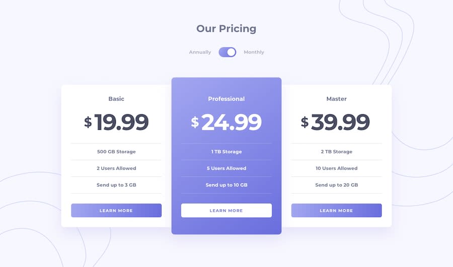
No focus-visible styles, so I can't tell where I am when using a keyboard. Focus-visible should be consistent and obvious, often a bold outline style
-
The toggle doesn't communicate state and is unusable via keyboard/screenreader/voice. 99% of the time toggles like this should be done with radio inputs not checkboxes, because that communicates exactly which option is selected at any time. This design is even more suited to radio inputs than many toggles because it has 2 visible labels already, one for each state. Also, you cannot hide inputs with display none or they become inaccessible. I recommend reading up on how to build an accessible toggle or even accessibly styled radios, or have a look at my solution for an example.
Here are some more changes and notes I just made in browser. Note the side margin on the cards is only to prevent them hitting screen edges. This could be better acheived by placing the bg-img on body and giving main a little padding. You never want components to touch edges
.card {
  /* margin: 0 auto; */
  margin: 0 1rem;
}

.card__wrapper.flex {
  /* align-items: stretch; */
  align-items: center;
}

.container {
  /* width: clamp(20.4375rem, 90%, 65.625rem); */
  width: clamp(20ch, 90%, 65.625rem);
  note: try clamp on the card__titles.
  note: Be wary of setting minimum values that are too small on clamps when used for box widths;
}

.card__btn {
  note: why is this a button element? What would you expect to happen on click?
}

@media (min-width: 56.25em) {
  .card {
    margin: -0.2rem;
  }
}

.attribution {
  /* position: absolute; */
}

.card.bg--secondary:last-of-type {
  z-index: -1;
}
Marked as helpful
