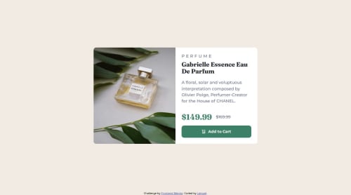
Responsive Product Card

Solution retrospective
Figuring out how to center the card in mobile-first design, switch layout using media queries and re-size the image in a card responsively.
I would test responsiveness for mobiles when layout is landscape and not only portrait.
What challenges did you encounter, and how did you overcome them?Centering the card - Removed use of 100vh from body, html and instead set body height to 100% to ensure it takes up full viewport. Then used margin to centralize card.
Resizing image - Sized image container to auto, added max-inline-size (learnt from Kevin Powell) to replace max-width: 100%, and constrained max-height to 250px on mobile devices so the image doesn't oversize as the viewport grows.
What specific areas of your project would you like help with?Responsive design - designing for very large screens and landscape Resizing images and more tips on responsive design for these cases. Tips on typography for very large screens, and controlling height so the card grows accordingly.
Please log in to post a comment
Log in with GitHubCommunity feedback
No feedback yet. Be the first to give feedback on lemz100's solution.
Join our Discord community
Join thousands of Frontend Mentor community members taking the challenges, sharing resources, helping each other, and chatting about all things front-end!
Join our Discord