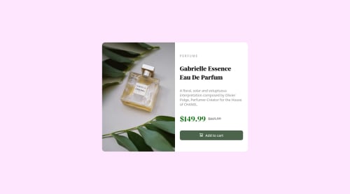
Responsive Product Card Design

Solution retrospective
Hello guys👋, this is my second project please watch it and give your feedback how is it. Thank You😊
Please log in to post a comment
Log in with GitHubCommunity feedback
- @sulemaan7070
A few things you can add to make it perfect.
- font family and font-weight to the h1.
- font family of the pricing section.
- you can give the image a max-width of 100%(so that it can be fit to the div).
- finally the text-container should be limited to a certain width on the mobile view
- you can change the whole body color instead of wrapper
Marked as helpful - @PiyushJain01
Hi 👋 You can give
background :#ffe6ff;to body instead of.wrapperbecause in mobile view some area at bottom side is not covered by the color also the wrapper is not aligned vertically center (in small screens). You can add the below code to fix these problems.body { height: 100vh; display: flex; background: #ffe6ff; flex-direction: column; justify-content: center; }I hope this will help you. Rest all is perfect. Happy Coding :)
Marked as helpful - @escarcan
Looks good! just remember to add the "alt" attribute to your img tags to improve accesibility and wrap your code with a main tag to fix your reports.


Join our Discord community
Join thousands of Frontend Mentor community members taking the challenges, sharing resources, helping each other, and chatting about all things front-end!
Join our Discord