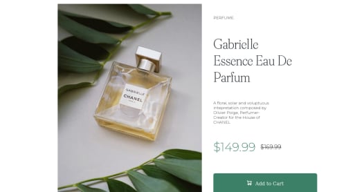
Responsive product card design using flexbox

Solution retrospective
- Pls, what can I do to make the mobile view highly responsive, especially regarding the Image??
- pls, how do I position the container(Image and content(text)) in the middle of the page(desktop view)?
- pls, how can I make both the image and the content(text) to be of equal width?
Please log in to post a comment
Log in with GitHubCommunity feedback
- @hectorjbd
Hello! I did this:
@media only screen and (min-width: 640px) and (max-width: 768px){ .contenedor{ max-width: 600px; } }
@media only screen and (max-width: 640px){ .contenedor{ min-width: auto; width: 90%; display: flex; flex-direction: column; border-radius: 20px; margin: auto; }
Marked as helpful - @melad99
2-To center the container in the middle of the page I used this for CSS in my solution and it works perfectly:
.class-name{
position:absolute;
top:50%;
left:50%;
transform:translate(-50%, -50%);
}
3:for the image and text I split the container into left and right ..giving the photo width and also the texts div and like this you can contain both.
I hope that's will help you and that you did a great job and try with this challenge ...good luck with other challenegs.
Marked as helpful - @Gloryjaw
Hi, nice try on the challenge.✨ There are lots of things you can do to improve the design. Some of them are-->
- Using % as widths to make your items responsive.
- You can give body display flex and height 100vh. Then use justify content and align items to center the whole container in the middle
- Images are by default not responsive, you should give them widths(in % of course). It will adjust its height according to aspect ratio.
Marked as helpful


Join our Discord community
Join thousands of Frontend Mentor community members taking the challenges, sharing resources, helping each other, and chatting about all things front-end!
Join our Discord