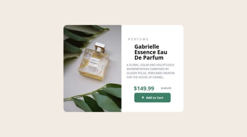
Responsive product card

Please log in to post a comment
Log in with GitHubCommunity feedback
- @Tech-Badhead
- The solution is close to the design but attention was not really on the detail which is highly essential in frontend development
- For accessibility best practise, the solution is not semantically structured and semantic HTML thrives well in that aspect.
- The solution does not really look good on various mobile devices, making apps look good on all screen sizes is one of the core fundamentals aspect of frontend development.
- Always look to import the font type given in the style guide of your project, it looks negligible but typography is just as important as responsiveness.
- You are doing awesome and one of the best way to get good is getting hands on building projects like this, keep going and improving along the way.
- P@mehmetcagriekici
Great effort! Although there are few problems on your CSS file which causes your design to break on mobile devices. First of all, although it is not a rule, you should usually design with mobile first approach, because that way you will have easier time when you try to implement media queries, or when you consider the responsiveness of your website. You should also use CSS variables under the ":root" which will reduce the work you do in media queries a lot, you can adjust them instead of whole classes. And finally, you should use CSS clamp() to make your variables responsive, so you won't need to update them in verbose media queries. Great Effort! Happy Codings!


Join our Discord community
Join thousands of Frontend Mentor community members taking the challenges, sharing resources, helping each other, and chatting about all things front-end!
Join our Discord