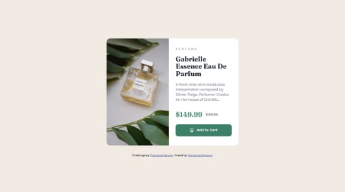
Responsive Product Card Preview

Please log in to post a comment
Log in with GitHubCommunity feedback
- @correlucas
👾Hi Mohamed Fareem, congratulations for your first solution!👋 Welcome to the Frontend Mentor Coding Community!
Great solution and great start! By what I saw you’re on the right track. I’ve few suggestions to you that you can consider to add to your code:
1.THE PICTURE TAG is a shortcut to deal with the multiple images in this challenge. So you can use the
<picture>tag instead of importing this as an<img>or using a div withbackground-image. Use it to place the images and make the change between mobile and desktop, instead of using adivorimgand set the change in the css withdisplay: nonewith the tag picture is more practical and easy. Note that for SEO / search engine reasons isn’t a better practice import this product image with CSS since this will make it harder to the image. Manage both images inside the<picture>tag and use the html to code to set when the images should change setting the devicemax-widthdepending of the device desktop + mobile.Check the link for the official documentation for
<picture>in W3 SCHOOLS:https://www.w3schools.com/tags/tag_picture.asp2.I saw that for some properties you’ve used
remand for otherspx. In this case it is better to use only one kind of unit to have a better organization for your code.relative unitsasremoremthat have a better fit if you want your site more accessible between different screen sizes and devices.REMandEMdoes not just apply to font size, but to all sizes as well.✌️ I hope this helps you and happy coding!
Marked as helpful

Join our Discord community
Join thousands of Frontend Mentor community members taking the challenges, sharing resources, helping each other, and chatting about all things front-end!
Join our Discord