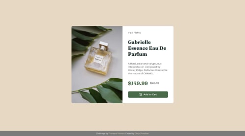
Responsive Product Card Using CSS Flexbox

Solution retrospective
I'm most proud of how I structured the layout using flexbox and CSS variables, making the design both responsive and easy to maintain. Next time, I would explore using CSS Grid for more complex layouts and consider adding subtle animations to enhance the user experience.
What challenges did you encounter, and how did you overcome them?One challenge I faced was ensuring the layout remained responsive on smaller screens. I overcame this by using flexbox effectively and implementing media queries to adjust the design for different screen sizes.
What specific areas of your project would you like help with?I'd appreciate feedback on accessibility improvements and any suggestions for enhancing the overall design and responsiveness.
Please log in to post a comment
Log in with GitHubCommunity feedback
- @amikoelvis
Hi Chrys! I’ve reviewed your solution for the Product Preview Card Component challenge, and it’s a solid effort with some standout features. Here’s my detailed feedback, along with answers to questions you might have, to help you refine this further. Does the Solution Include Semantic HTML? Your HTML uses semantic elements effectively, which is a big plus:
<main class="product-card"> clearly defines the primary content, aiding screen readers and SEO. <footer class="attribution"> separates the attribution cleanly from the main content.Suggestions: The <div class="perfume-bottle"> for the image could be more semantic. Since it’s a key visual, consider <img> or <picture> with an alt attribute (e.g., alt="Gabrielle Essence perfume bottle") instead of a background-image in CSS. This improves accessibility and searchability.
The <h2>Perfume</h2> and <h1>Gabrielle Essence Eau De Parfum</h1> order feels reversed. Typically, <h1> is the main title (product name), and <h2> is a subtitle. Swapping them or using <span> for "Perfume" (like a category label) might align better with heading hierarchy.
Improvements: Image Accessibility: The .perfume-bottle div lacks an accessible description since it’s a CSS background. Switching to <picture> like this would help:
<picture class="perfume-bottle">
  <source media="(min-width: 600px)" srcset="assets/images/image-product-desktop.jpg">
  <img src="assets/images/image-product-mobile.jpg" alt="Gabrielle Essence perfume bottle">
</picture>
Then adjust CSS to style the <img> instead of background-image.
Button: The <img> inside the button lacks an alt attribute. Add alt="Cart icon" to describe it for screen readers:
<button type="button">
  <img src="assets/images/icon-cart.svg" alt="Cart icon" width="15" height="15">
  Add to Cart
</button>
Focus States: There’s no :focus style for the button. Adding one (e.g., an outline) ensures keyboard users see interactivity: ``css button:focus { outline: 2px solid var(--green-700); outline-offset: 2px; }
Marked as helpful

Join our Discord community
Join thousands of Frontend Mentor community members taking the challenges, sharing resources, helping each other, and chatting about all things front-end!
Join our Discord