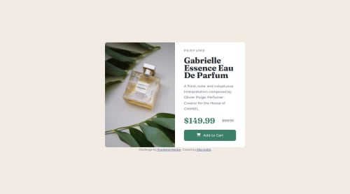
Submitted over 1 year agoA solution to the Product preview card component challenge
Responsive product card using CSS flexbox

P
@Alexandru736
Solution retrospective
What are you most proud of, and what would you do differently next time?
The fact that I managed to build a responsive solution applying relative units
What challenges did you encounter, and how did you overcome them?First of all, I didn't know anything about responsiveness so I looked up for it. Moreover, I had difficulties importing the font awesome icon. Other than that, I don't think there were any other challenges
What specific areas of your project would you like help with?I still don't think I have a full grasp of that responsiveness means. Therefore, I kindly ask you to check my work and my code to see if there is still something that I can improve/correct regarding this topic.
Code
Loading...
Please log in to post a comment
Log in with GitHubCommunity feedback
No feedback yet. Be the first to give feedback on Alexandru736's solution.
Join our Discord community
Join thousands of Frontend Mentor community members taking the challenges, sharing resources, helping each other, and chatting about all things front-end!
Join our Discord