Not Found
Not Found
Not Found
Not Found
Not Found
Not Found
Not Found
Not Found
Not Found
Not Found
Not Found
Not Found
Not Found
Not Found
Not Found
Not Found
Not Found
Not Found
Not Found
Not Found

Submitted

Responsive product card using Css grid and flexbox

Caroline 210

@Carolkiarie

Desktop design screenshot for the Product preview card component coding challenge

This is a solution for...

  • HTML
  • CSS
1newbie
View challenge

Design comparison


SolutionDesign

Solution retrospective


Hello, I am finally done and would be happy to receive feedback especially on the code. I still find it a bit confusing how to improve accessibility when writing codes. If i include "Aria label" is it enough? Thank you for your time.

Community feedback

Lucas 👾 104,580

@correlucas

Posted

👾Hello @Carolkiarie, Congratulations on completing this challenge!

Your solution its almost done and I’ve some tips to help you to improve it:

1.Add the website favicon inserting the svg image inside the <head>. <link rel="icon" type="image/x-icon" href="./images/favicon-32x32.png">

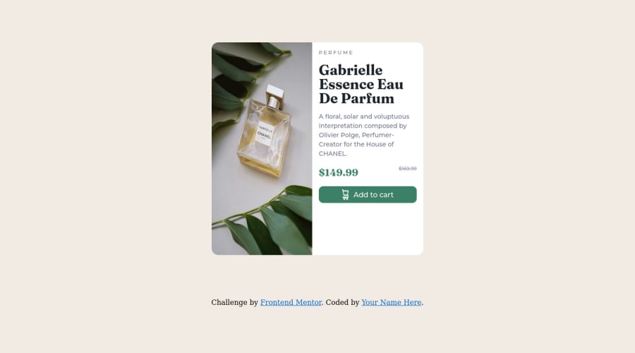
2.The image is getting distorted, to avoid this behavior, use these steps, first add display: block and max-width: 100% to the <img> selector. To improve the responsiveness even more by adding the auto-crop property you can add object-fit: cover to make the image crop inside the container. Here’s the code:

img {
    display: block;
    object-fit: cover;
    max-width: 100%;
}


3.Use the **THE PICTURE TAG** that is a shortcut to deal with the multiple images in this challenge. So you can use the  `<picture>` tag instead of importing this as an `<img>`  or using a div with `background-image`. Use it to place the images and make the   change between mobile and desktop, instead of using a `div` or `img` and set the change in the css with `display: none` with the tag picture is more practical and easy. Note that  for **SEO / search engine** reasons isn’t a better practice import this product image with CSS since this will make it harder to the image. Manage both images inside the `<picture>` tag and use the html to code to set when the images should change setting the device `max-width` depending of the device **desktop + mobile**. 

Check the link for the official documentation for `<picture>` in **W3 SCHOOLS**:
[`https://www.w3schools.com/tags/tag_picture.asp`](https://www.w3schools.com/tags/tag_picture.asp)

See the example below:
<picture> <source media="(max-width:650px)" srcset="./images/image-product-mobile.jpg"> <img src="./images/image-product-desktop.jpg" alt="Gabrielle Parfum" style="width:auto;"> </picture> ```

👨‍💻Here's my solution for this challenge if you wants to see how I build it: https://www.frontendmentor.io/solutions/product-preview-card-vanilla-css-and-custom-hover-state-on-hero-85A1JsueD1

✌️ I hope this helps you and happy coding!

Marked as helpful

0

Caroline 210

@Carolkiarie

Posted

@correlucas Hey Lucas. Thank you so much for the suggestion. let me make the changes. Ihad previously not noticed that the image is getting distorted. And i have just tried to look at your solution for the same challenge. however, the link is not working.

0

@VCarames

Posted

**Hey @Carolkiarie, regarding your question:

  • The Alt Tag description for the image needs to be improved upon. You want to describe what the image is; they need to be readable. Assume you’re describing the image/icon to someone.

  • The old price isnt being announce properly to screenreaders. You want to wrap it in a Del Element and include a sr-only text explaining that this is the old price.

  • The "shopping cart" icon is decorative, so its Alt Tag needs to be left blank.

Here are some links that can help you out:

https://www.w3.org/WAI/fundamentals/accessibility-intro/

https://webaccess.berkeley.edu/resources/tips/web-accessibility

Some suggestions to improve you code:

  • Your card layout is broken your going to want to go back and fix that.

  • Your cards responsiveness needs working, here's a link to help you get started:

https://web.dev/learn/design/

  • When using images that are different size for different breakpoints, its’ far more effective to use the <picture> element. By using this element not are able to use different size images, you can also save on bandwidth, meaning your content loads faster.

Syntax:

  <picture>
    <source media="(min-width: )" srcset="">
    <img src="" alt="">
  </picture>

Source:

https://www.w3schools.com/html/html_images_picture.asp

https://web.dev/learn/design/picture-element/

-- Your CSS Reset should include:

img,
picture,
video,
canvas,
svg {
  max-inline-size: 100%;
  block-size: auto;
}

To help make all your images responsive.

Happy Coding!

Marked as helpful

0

Caroline 210

@Carolkiarie

Posted

@vcarames Thank you so much for the suggestion. I however do not understand it when you say that the card layout is broken. Could you kindly clarify for me further. Thank you!

0

@VCarames

Posted

@Carolkiarie

When I open the your website, your card is stretching to the top and bottom of my screen, making everything look out of place.

0

Please log in to post a comment

Log in with GitHub
Discord logo

Join our Discord community

Join thousands of Frontend Mentor community members taking the challenges, sharing resources, helping each other, and chatting about all things front-end!

Join our Discord