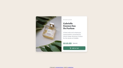
Responsive product card using Flexbox and CSS Grid

Solution retrospective
What I'm most proud of:
Responsive Design: I take particular pride in the layout's responsiveness. It effectively adjusts to various screen dimensions, particularly transitioning from mobile to desktop displays, utilizing CSS Grid and Flexbox. Streamlined and Aesthetic Design: I have successfully developed a straightforward yet visually engaging design that accentuates the product while preserving clarity in textual hierarchy and spacing. Interactivity: The "Add to Cart" button features a seamless hover effect that improves user experience without using JavaScript. This exemplifies the efficacy of CSS in managing interactive elements.
What I would do differently next time:
Enhancements in Accessibility: I would prioritize accessibility improvements. Incorporating aria labels and enhancing button accessibility for screen readers could enhance the user experience for individuals with disabilities. Image Optimization: The product image could be further optimized for expedited loading times, particularly for mobile users, by employing responsive image sizes (srcset). Utilization of CSS Variables: I could employ CSS variables to retain colors and font sizes, so enhancing code maintainability and facilitating future customization. Font Consistency: Although the Montserrat and Fraunces typefaces complement each other, I may explore alternative font combinations to enhance readability or achieve a more distinctive look.
What challenges did you encounter, and how did you overcome them?- Attaining a Responsive Layout:
Challenge: Ensuring the design is responsive across various devices (mobile, tablet, and desktop) while maintaining a consistent and user-friendly interface. Solution: I employed CSS Grid and Flexbox to develop a versatile layout. CSS Grid was very effective for structuring material systematically, but Flexbox facilitated the alignment and centering of items. I established breakpoints for smaller displays to dynamically modify the layout, providing optimal appearance across all devices.
- Image Management and Responsiveness:
Challenge: Ensuring the product image is appropriately contained and responsive to varying screen sizes without distortion. Solution: I employed max-width: 100% and height: auto for the image to ensure responsiveness. This guaranteed that the image preserves its aspect ratio and adjusts appropriately according to the screen width.
- Typography Hierarchy & Spacing:
Challenge: Maintaining clarity and visual attractiveness of the text hierarchy (product name, description, price), particularly during the transition from desktop to mobile viewing. Solution: I meticulously utilized varying font sizes, weights, and spacing for each text piece. I employed larger fonts for the product name and price to enhance their visibility. I decreased the font size of the product description on mobile and implemented line breaks to maintain readability without encroaching on screen space.
- Button Aesthetics and Hover Interaction:
Task: Create a visually distinctive button that integrates seamlessly with the overall design, using hover effects for interactivity. Solution: I created a button including a minimalist background color and a delicate border-radius. I incorporated a hover effect that alters the backdrop color for interactivity. This was accomplished utilizing solely CSS, without the involvement of JavaScript, which functioned effectively and maintained a pristine design.
- Refining CSS:
Challenge: Maintaining uniform spacing and padding between items while ensuring precise alignment across diverse screen sizes. Resolution: I dedicated time on modifying the padding and margin values for various items through the utilization of media queries. I ensured to test the layout on several devices to verify that all elements were properly aligned and visually harmonious. Through the application of various CSS methodologies (Grid, Flexbox, media queries) and comprehensive testing, I successfully addressed these problems and produced a responsive, aesthetically pleasing product card.
What specific areas of your project would you like help with?- Sophisticated CSS Strategies for Responsiveness:
Inquiry: Although I have utilized CSS Grid and Flexbox for responsive design, I seek opinion on further strategies or best practices for further optimizing layouts across a broader spectrum of screen sizes, particularly for bigger desktop displays (1440px+). What CSS techniques or tools can improve responsiveness and layout behavior?
- Performance Enhancement:
Inquiry: Are there recommendations for enhancing the efficacy of this project? I want to decrease load times while maintaining visual quality (e.g., picture optimization, lazy loading). What strategies can I employ to enhance performance, particularly for mobile users with limited connectivity?
- Accessibility of Buttons:
Inquiry: Although the buttons are crafted for visual attractiveness, I need input regarding their accessibility. What enhancements can I do to guarantee that the buttons are entirely accessible to all users, including those utilizing screen readers or keyboard navigation? Would the incorporation of ARIA labels or roles enhance the button's accessibility?
- Design Uniformity:
Request: I seek opinions on the overall design coherence. Do you believe the visual hierarchy (font sizes, button designs, spacing) is uniform throughout the project, particularly during transitions between mobile and desktop views? Are there specific locations where I can enhance visual balance or alignment to improve user experience?
- CSS File Dimensions:
Inquiry: Given the project's modest scale, my existing CSS file is not extensive; yet, I seek advice on maintaining modularity and ease of maintenance in the CSS as the project expands. What strategies can I employ to enhance my CSS management for scalability? By concentrating on these particular areas, I aim to obtain constructive comments that will enhance the overall quality and performance of the project.
Please log in to post a comment
Log in with GitHubCommunity feedback
No feedback yet. Be the first to give feedback on Sudharshan Murugan's solution.
Join our Discord community
Join thousands of Frontend Mentor community members taking the challenges, sharing resources, helping each other, and chatting about all things front-end!
Join our Discord