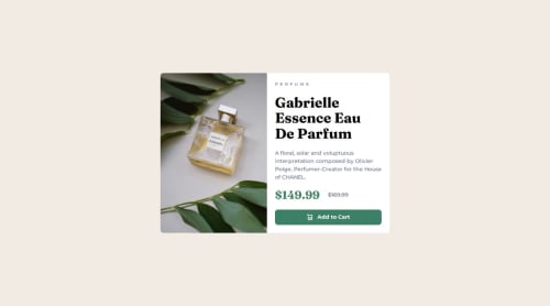
Responsive product card using Flexbox and custom properties

Solution retrospective
I'm most proud of how clean and responsive the layout turned out using just Flexbox and semantic HTML. I was able to closely match the original design and make it responsive for both mobile and desktop views.
Next time, I would like to explore implementing the same design using CSS Grid or utility-first CSS frameworks like Tailwind to compare the workflow and flexibility.
What challenges did you encounter, and how did you overcome them?One challenge was ensuring the image and content aligned perfectly on desktop view, especially maintaining equal height between them.
I solved this using flex: 1 and object-fit: cover inside the media query.
Another small challenge was vertical scrolling on smaller screens, but after checking the original design, I confirmed that minimal scroll is expected and acceptable.
What specific areas of your project would you like help with?I would love feedback on anything.
Please log in to post a comment
Log in with GitHubCommunity feedback
No feedback yet. Be the first to give feedback on Abdul Subhan's solution.
Join our Discord community
Join thousands of Frontend Mentor community members taking the challenges, sharing resources, helping each other, and chatting about all things front-end!
Join our Discord