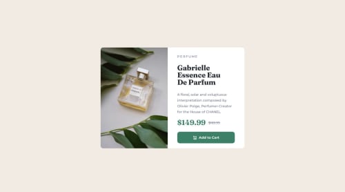
Responsive product card using flexbox, rem units, and a media query

Solution retrospective
any feedback or advice is appreciated! I had a lot of fun making this and I'm not sure if I could do anything better. I had some thoughts of possibly overusing rem units in this case?
Please log in to post a comment
Log in with GitHubCommunity feedback
- @DanonymousCoder
Nice work bro, keep grinding. Your work is awesome you still need to do some little adjustment. Firstly, the element 'Perfume' isn't given the right color and also you need to add a letter spacing to it. Secondly, your slashed price is not in the right position. It should be at the upper part of the actual price. Thirdly the responsiveness is not looking really good, you should the image to the image given for the mobile view. And also, adjust the height of the container and make it automatically appear at the center of the screen.
Marked as helpful - @omar-csdev
Hi, it looks good on large screens but not so much on smaller devices. I advice you to check that out and make it responsive using @media queries. Also on smaller devices the image should change to the mobile image provided in the files. You can achieve this using the <picture> tag, look that up it's not difficult. Good luck!
Marked as helpful


Join our Discord community
Join thousands of Frontend Mentor community members taking the challenges, sharing resources, helping each other, and chatting about all things front-end!
Join our Discord