Skip to content
  • Unlock Pro
  • Log in with GitHub
Solution
Submitted over 2 years ago

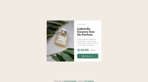
Responsive Product Card using Vanilla CSS and HTML

Koi Hastilow•90
@KoiHast
A solution to the Product preview card component challenge
View live sitePreview (opens in new tab)View codeCode (opens in new tab)

Solution retrospective


GitHub and I are about to go a round if I don't figure this stuff out soon. It didn't want to recognize my cart icon despite it being the EXACT SAME as it was on my desktop, and THAT was working.

ANYWAY, my biggest problem with this one was figuring out how to change images based on screen size. I think I figured it out, but if anyone wants to look over the code and see if I did it in a weird/incorrect way, I'd really appreciate it!

Code
Select a file

Please log in to post a comment

Log in with GitHub

Community feedback

  • Melvin Aguilar 🧑🏻‍💻•61,020
    @MelvinAguilar
    Posted over 2 years ago

    Hello there 👋. Good job on completing the challenge !

    I have some suggestions about your code that might interest you.

    HTML 🏷️:

    • In my humble opinion, the tag <picture> is a very good choice when switching between images.
    • Avoid using uppercase text in your HTML because screen readers will read it letter by letter. You can use the text-transform property to transform the text to uppercase in CSS.

      The word "perfume" is written as separate letters, which does not convey the meaning that this text is a single cohesive unit of content. This can be confusing for users and for screen readers, as it can be difficult to understand the meaning of the text.

      Example:

      <p>Perfume</p>
      
      p {
          text-transform: uppercase;
          letter-spacing: 0.3em;
      }
      

    Alt text 📷:

    • The alt attribute should not contain the words "image", "photo", or "picture", because the image tag already conveys that information.
    • Not all images should have alt text. The cart-icon is a decorative image, it does not add any information to the page. You should use an empty alt attribute instead of a descriptive one. You can read more about this here 📘.

      If you want to learn more about the alt attribute, you can read this article. 📘.

    CSS 🎨:.

    • Use min-height: 100vh instead of height. Setting the height to 100vh may result in the component being cut off on smaller screens, such as a mobile phone in landscape orientation.

      screenshot-imgur (landscape mode)📸

    I hope you find it useful! 😄 Above all, the solution you submitted is great!

    Happy coding!

    Marked as helpful
  • Hassia Issah•50,390
    @Hassiai
    Posted over 2 years ago

    To center the main on the page using flexbox, replace the height in the body with min-height: 100vh.

    There is no need to give the main a height value, rather give .text-container a padding value for all the sides, this will replace the height of the main.

    In the desktop design give .product-image and . text-container a width of 50% and the img a width of 100% and height of 100%.

    In the media query, give .product-image and .text-container a width of 100%.

    Use relative units like rem or em as unit for the padding, margin and width values, instead of using px which is an absolute unit. For more on CSS units Click here

    Hope am helpful.

    Well done for completing this challenge. HAPPY CODING

Join our Discord community

Join thousands of Frontend Mentor community members taking the challenges, sharing resources, helping each other, and chatting about all things front-end!

Join our Discord

Stay up to datewith new challenges, featured solutions, selected articles, and our latest news

Frontend Mentor

  • Unlock Pro
  • Contact us
  • FAQs
  • Become a partner

Explore

  • Learning paths
  • Challenges
  • Solutions
  • Articles

Community

  • Discord
  • Guidelines

For companies

  • Hire developers
  • Train developers
© Frontend Mentor 2019 - 2025
  • Terms
  • Cookie Policy
  • Privacy Policy
  • License

Oops! 😬

You need to be logged in before you can do that.

Log in with GitHub

Oops! 😬

You need to be logged in before you can do that.

Log in with GitHub

How does the accessibility report work?

When a solution is submitted, we use axe-core to run an automated audit of your code.

This picks out common accessibility issues like not using semantic HTML and not having proper heading hierarchies, among others.

This automated audit is fairly surface level, so we encourage to you review the project and code in more detail with accessibility best practices in mind.

How does the CSS report work?

When a solution is submitted, we use stylelint to run an automated check on the CSS code.

We've added some of our own linting rules based on recommended best practices. These rules are prefixed with frontend-mentor/ which you'll see at the top of each issue in the report.

The report will audit all CSS, SCSS and Less files in your repository.

How does the HTML validation report work?

When a solution is submitted, we use html-validate to run an automated check on the HTML code.

The report picks out common HTML issues such as not using headings within section elements and incorrect nesting of elements, among others.

Note that the report can pick up “invalid” attributes, which some frameworks automatically add to the HTML. These attributes are crucial for how the frameworks function, although they’re technically not valid HTML. As such, some projects can show up with many HTML validation errors, which are benign and are a necessary part of the framework.

How does the JavaScript validation report work?

When a solution is submitted, we use eslint to run an automated check on the JavaScript code.

The report picks out common JavaScript issues such as not using semicolons and using var instead of let or const, among others.

The report will audit all JS and JSX files in your repository. We currently do not support Typescript or other frontend frameworks.

Oops! 😬

You need to be logged in before you can do that.

Log in with GitHub

Oops! 😬

You need to be logged in before you can do that.

Log in with GitHub