Skip to content
  • Unlock Pro
  • Log in with GitHub
Solution
Submitted 2 months ago

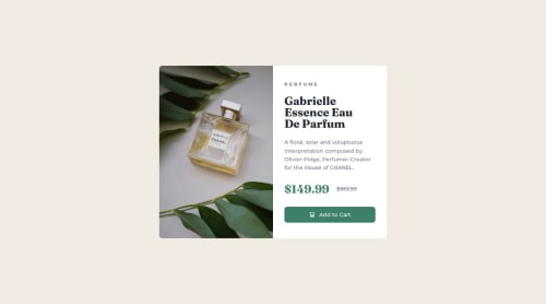
Responsive Product Card with Flexbox

P
j3dd3rs•90
@j3dd3rs
A solution to the Product preview card component challenge
View live sitePreview (opens in new tab)View codeCode (opens in new tab)

Solution retrospective


What are you most proud of, and what would you do differently next time?

That I managed to figure out a few problems by myself by searching around. I also managed to come back to it the following day a bit more rested to finalise the last bit on the image overlay I think needed adding, or at least made it look better.

What challenges did you encounter, and how did you overcome them?

Getting the image to properly display with an overlay. I googled around and found some solutions. Also on how to display two types of images. I couldn't find the best responsive way for only loading the one image, instead settling for classes to sort it.

What specific areas of your project would you like help with?

Is there a way to make the image responsive part better?

Code
Select a file

Please log in to post a comment

Log in with GitHub

Community feedback

  • Muskan Fatima•160
    @muskan-fatim
    Posted 2 months ago

    Hi there! 👋 First off — your card design looks awesome! Super clean and nicely styled — great work on sticking with it and solving issues one by one. That’s the best way to grow as a developer 💪

    About your question on the image responsiveness — I totally understand what you were aiming for, and you did a great job figuring it out with classes. One idea that might help simplify things and make it more responsive is to apply your image styling on the container that holds the image, instead of the image itself.

    Another approach that could really help here is using the <picture> element. It lets you load different images for different screen sizes, like this:

    <picture>
      <source media="(min-width: 600px)" srcset="image-desktop.jpg">
      <img src="image-mobile.jpg" alt="Product image">
    </picture>
    

    This way, the browser automatically chooses the best image to load based on screen size — no extra CSS classes needed! Plus, it helps with performance, since it avoids loading both images.

    Also, make sure your image (or its container) has styles like:

    width: 100%;
    height: auto;
    object-fit: cover;
    

    That way, the image scales nicely inside flexible containers.

    You should feel really proud that you pushed through and solved it with your own research — that’s huge! Keep experimenting and building. You’re clearly on the right path. 🚀

    Marked as helpful
  • Bhavik Thakur•320
    @bhavikthakur
    Posted 2 months ago

    Great job! Your code looks nice, I'd suggest you to try the source tag and define width and change the image as per the viewport of the user's device.

Join our Discord community

Join thousands of Frontend Mentor community members taking the challenges, sharing resources, helping each other, and chatting about all things front-end!

Join our Discord
Frontend Mentor logo

Stay up to datewith new challenges, featured solutions, selected articles, and our latest news

Frontend Mentor

  • Unlock Pro
  • Contact us
  • FAQs
  • Become a partner

Explore

  • Learning paths
  • Challenges
  • Solutions
  • Articles

Community

  • Discord
  • Guidelines

For companies

  • Hire developers
  • Train developers
© Frontend Mentor 2019 - 2025
  • Terms
  • Cookie Policy
  • Privacy Policy
  • License

Oops! 😬

You need to be logged in before you can do that.

Log in with GitHub

Oops! 😬

You need to be logged in before you can do that.

Log in with GitHub

How does the accessibility report work?

When a solution is submitted, we use axe-core to run an automated audit of your code.

This picks out common accessibility issues like not using semantic HTML and not having proper heading hierarchies, among others.

This automated audit is fairly surface level, so we encourage to you review the project and code in more detail with accessibility best practices in mind.

How does the CSS report work?

When a solution is submitted, we use stylelint to run an automated check on the CSS code.

We've added some of our own linting rules based on recommended best practices. These rules are prefixed with frontend-mentor/ which you'll see at the top of each issue in the report.

The report will audit all CSS, SCSS and Less files in your repository.

How does the HTML validation report work?

When a solution is submitted, we use html-validate to run an automated check on the HTML code.

The report picks out common HTML issues such as not using headings within section elements and incorrect nesting of elements, among others.

Note that the report can pick up “invalid” attributes, which some frameworks automatically add to the HTML. These attributes are crucial for how the frameworks function, although they’re technically not valid HTML. As such, some projects can show up with many HTML validation errors, which are benign and are a necessary part of the framework.

How does the JavaScript validation report work?

When a solution is submitted, we use eslint to run an automated check on the JavaScript code.

The report picks out common JavaScript issues such as not using semicolons and using var instead of let or const, among others.

The report will audit all JS and JSX files in your repository. We currently do not support Typescript or other frontend frameworks.

Oops! 😬

You need to be logged in before you can do that.

Log in with GitHub

Oops! 😬

You need to be logged in before you can do that.

Log in with GitHub