Skip to content
  • Unlock Pro
  • Log in with GitHub
Solution
Submitted 8 months ago

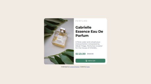
Responsive product card with media query

Tarek Islam•220
@tarekul
A solution to the Product preview card component challenge
View live sitePreview (opens in new tab)View codeCode (opens in new tab)

Solution retrospective


What are you most proud of, and what would you do differently next time?

I am most proud of creating the two layouts for desktop and mobile.

What challenges did you encounter, and how did you overcome them?

I encountered challenges in getting the image to be responsive for desktop vs mobile. I also encountered challenge in switching between the two images based on viewport size.

What specific areas of your project would you like help with?

I'd like feedback in the use of gap vs justify-content. Also feedback in the use of flex-grow, flex-shrink.

Code
Select a file

Please log in to post a comment

Log in with GitHub

Community feedback

  • Krishna•40
    @Krishnajangir
    Posted 8 months ago

    Very nice job but here are some feedback points:

    CSS Suggestions:

    1.Target Specific Elements for Resetting Styles: Instead of using the universal * selector, target only the elements you need (e.g., body, h1, p, img) to reset margins and paddings.

    Example: body, h1, p, img, ul, li, button { margin: 0; padding: 0; }

    2.Media Queries: Move media queries for layout adjustments to specific sections, rather than inside .main to improve scalability. Add max-width to .main to prevent stretching on large screens.

    Example: .main { width: 100%; max-width: 1200px; margin: 0 auto; }

    3.Use clamp() Responsibly: clamp() is great for responsive text, but test different screen sizes to ensure readability. Adjust font-weight and font-size for better legibility.

    4.Avoid Unnecessary overflow: hidden;: If not needed, remove overflow: hidden; from .main.

    5.Smooth Transitions: Add transition effects to button hover and active states for a smoother user experience.

    Example: .cart { transition: background-color 0.3s ease, transform 0.1s ease; }

    HTML Suggestions:

    1.Improve Accessibility for Buttons: Add aria-label for better accessibility and ensure images inside buttons have descriptive alt text.

    Example: <button class="cart" aria-label="Add to Cart"> <img src="images/icon-cart.svg" alt="Add to Cart Icon"> Add to Cart </button>

    2.Use Semantic HTML: Wrap product info in <article> and the section in a <section> tag for better structure and SEO.

    Example:

    <section class="main"> <article> <!-- Image and content --> </article> </section> alt Text for Images: Always add alt attributes for all images, including those in <source> tags, for accessibility.
    Marked as helpful

Join our Discord community

Join thousands of Frontend Mentor community members taking the challenges, sharing resources, helping each other, and chatting about all things front-end!

Join our Discord
Frontend Mentor logo

Stay up to datewith new challenges, featured solutions, selected articles, and our latest news

Frontend Mentor

  • Unlock Pro
  • Contact us
  • FAQs
  • Become a partner

Explore

  • Learning paths
  • Challenges
  • Solutions
  • Articles

Community

  • Discord
  • Guidelines

For companies

  • Hire developers
  • Train developers
© Frontend Mentor 2019 - 2025
  • Terms
  • Cookie Policy
  • Privacy Policy
  • License

Oops! 😬

You need to be logged in before you can do that.

Log in with GitHub

Oops! 😬

You need to be logged in before you can do that.

Log in with GitHub

How does the accessibility report work?

When a solution is submitted, we use axe-core to run an automated audit of your code.

This picks out common accessibility issues like not using semantic HTML and not having proper heading hierarchies, among others.

This automated audit is fairly surface level, so we encourage to you review the project and code in more detail with accessibility best practices in mind.

How does the CSS report work?

When a solution is submitted, we use stylelint to run an automated check on the CSS code.

We've added some of our own linting rules based on recommended best practices. These rules are prefixed with frontend-mentor/ which you'll see at the top of each issue in the report.

The report will audit all CSS, SCSS and Less files in your repository.

How does the HTML validation report work?

When a solution is submitted, we use html-validate to run an automated check on the HTML code.

The report picks out common HTML issues such as not using headings within section elements and incorrect nesting of elements, among others.

Note that the report can pick up “invalid” attributes, which some frameworks automatically add to the HTML. These attributes are crucial for how the frameworks function, although they’re technically not valid HTML. As such, some projects can show up with many HTML validation errors, which are benign and are a necessary part of the framework.

How does the JavaScript validation report work?

When a solution is submitted, we use eslint to run an automated check on the JavaScript code.

The report picks out common JavaScript issues such as not using semicolons and using var instead of let or const, among others.

The report will audit all JS and JSX files in your repository. We currently do not support Typescript or other frontend frameworks.

Oops! 😬

You need to be logged in before you can do that.

Log in with GitHub