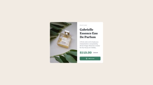
Skip to content
  • Learning paths
  • Challenges
  • Solutions
  • Articles
  • Unlock Pro
  • Log in with GitHub
Solution
Submitted over 2 years ago

Responsive Product Cards | HTML & CSS

Corey•90
@cjay44
A solution to the Product preview card component challenge
View live sitePreview (opens in new tab)View codeCode (opens in new tab)

Solution retrospective


Another one done! Trying to use logical properties more, and keeping in mind of semantics.

What other properties should I look at/into when designing for responsiveness?

Any feedback is welcome!

Thank you!

Code
Select a file

Please log in to post a comment

Log in with GitHub

Community feedback

  • Account deletedPosted over 2 years ago

    Hey @cjay44, great job on this project!

    To make it easier to deal with CSS and have more control over your content, I suggest taking a look at CSS Resets.

    It makes it easier to make changes and will ensure that everything will look the same regardless of browser used and don’t have to worry that the browser will be using its own styling.

    One important thing about CSS Resets, is that there is no such thing as “one is better than the other.”

    CSS Resets are customizable for your preference.

    Here are few CSS Resets that you can look at and use to create your own CSS Reset or just copy and paste one that already prebuilt.

    https://www.joshwcomeau.com/css/custom-css-reset/

    https://meyerweb.com/eric/tools/css/reset/

    http://html5doctor.com/html-5-reset-stylesheet/

    Happy Coding!

    Marked as helpful
  • Lucas 👾•104,200
    @correlucas
    Posted over 2 years ago

    👾Hello @cjay44, Congratulations on completing this challenge!

    Your solution its almost done and I’ve some tips to help you to improve it:

    I saw that you’ve used flexbox to place the content and create the layout.

    I think the best way to build this component with two columns is by using GRID LAYOUT since it is simpler to manage the columns and then create the media query for mobile. Here’s the steps to create it with grid create the main block to hold all the content (you can use <main> to wrap), set its width as max-width: 900px (it's the container size) and display: grid / grid-template-column: 1fr 1fr(this means that your component will have two columns with 50% of the container width each thats 450px). To manage the column with the text use flexbox and gap to give it the spacing between the texts or use padding-bottom to separate them.

    Then to create the mobile version, all you need to do is to change the container flow vertically with grid-template-column: 1fr.

    Using <picture> you’ve more control over the elements and its better than using the product image as <img> or background-image. Look that for SEO and search engine reasons it isn't a better practice to import this product image with CSS since this will make it harder to the image. You can manage both images inside the <picture> tag and use the html to code to set when the images should change setting the device max-width depending of the device (phone / computer) Here’s a guide about how to use picture: https://www.w3schools.com/tags/tag_picture.asp

    ✌️ I hope this helps you and happy coding!

  • Corey•90
    @cjay44
    Posted over 2 years ago

    Looks like I got the width/height a little off - Those figma files would be nice

Join our Discord community

Join thousands of Frontend Mentor community members taking the challenges, sharing resources, helping each other, and chatting about all things front-end!

Join our Discord
Frontend Mentor logo

Stay up to datewith new challenges, featured solutions, selected articles, and our latest news

Frontend Mentor

  • Unlock Pro
  • Contact us
  • FAQs
  • Become a partner

Explore

  • Learning paths
  • Challenges
  • Solutions
  • Articles

Community

  • Discord
  • Guidelines

For companies

  • Hire developers
  • Train developers
© Frontend Mentor 2019 - 2025
  • Terms
  • Cookie Policy
  • Privacy Policy
  • License

Oops! 😬

You need to be logged in before you can do that.

Log in with GitHub

Oops! 😬

You need to be logged in before you can do that.

Log in with GitHub

Oops! 😬

You need to be logged in before you can do that.

Log in with GitHub

Oops! 😬

You need to be logged in before you can do that.

Log in with GitHub

Oops! 😬

You need to be logged in before you can do that.

Log in with GitHub