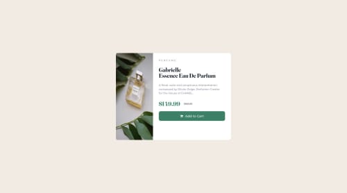
Responsive Product Page Sale

Solution retrospective
Initially had issues with splitting the card to have an image on one side and text on the other side, it was fun to figure out though! Also, aligning everything for product description and getting everything to look as close as possible to the jpg as possible. It's not perfect but I still enjoyed it!
Please log in to post a comment
Log in with GitHubCommunity feedback
- @superschooler
Hi Albert,
Building on what @ayushdotdev suggested, if you simply add
.card-img { width: 50% }, the card would only be 25% the width of the container since you have it wrapped in another div. You should be able to get rid of the div sandwiched between .card and .card-img since it only holds one item (.card-img).Additionally, to make it responsive on a mobile device, you can try the following:
@media (max-width: 550px) {
	.card {
		flex-direction: column;
		height: auto;
		margin: 24px;
	}

	.card-img {
		object-fit: cover; /* Or Change to Smaller Image */
		border-radius: 3% 3% 0 0;
		height: 300px;
	}

	.card-text {
		width: 100%;
		height: auto;
		padding-bottom: 24px;
	}
}
This is a pretty simple solution that doesn't quite make it perfect, but is a great start! Nice work on your project 👍
Marked as helpful - @ayushdotdev
Hi Albert, by giving "card-img" class a width of 50% and "card-text" container class width of 50% that will make both separated halves equal
this fix will make it look much similar
Marked as helpful


Join our Discord community
Join thousands of Frontend Mentor community members taking the challenges, sharing resources, helping each other, and chatting about all things front-end!
Join our Discord