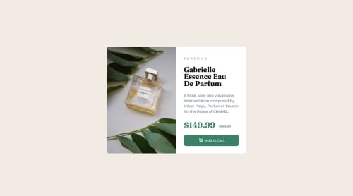
Responsive product page using GRID

Solution retrospective
My approach
Picked up another easy looking challenge which did not have a lot of issues. I was going to use grid for this but realised midway that block level elements do the trick with good padding and margin rules. I still need to figure out how to margin and padding is going to work when we are switching view. For this one, I went from desktop to mobile instead of the other way around.
Some questions and notes I had for the community:
- Is this approach feasible? I need to figure out how do people work with their margins and padding while designing things.
- I'll pick a bit more difficult next project to understand the usage of grid and get better at responsiveness in general.
- Need to figure out why my firefox dev console shows a different view compared to when I actually use my phone to see it.
Please log in to post a comment
Log in with GitHubCommunity feedback
- @MaximilianoDanielGarcia
Hi @amoeba25, great job!
Consider set a fixed width so that it doesn't wrap depending on the screen resolution, I recommend
width: 600px;.Also, I've noticed that you aren't using the image for mobile. Here an example that how to use multiple img depending of media queries.
<picture>
  <source media="(width <= 465px)" srcset="images/image-product-mobile.jpg">
  <img src="iimages/image-product-desktop.jpg" alt="Perfume image">
</picture>
I hope these are helpful to you.
Marked as helpful - P@HiQendresa
Hi @amoeba25. 👋
Congratulation on finishing this challenge 🎉 . Remember, we all face challenges when learning something new, and you're doing great!
I wanted to share a few tips that might make things a bit easier for you.
HTML Structure :
- Use Semantic Elements: Choose semantic HTML5 elements (like <header>, <nav>, <main>, <article>, <section>, <aside>, <footer>) to convey the meaning of different parts of your page. This improves accessibility and makes your code more readable.
- Div as a Generic Container:
- Use a <div> element instead of <section> if the purpose is simply to group content within a card component. <div> is a generic container that doesn't carry any specific semantic meaning, making it versatile for grouping elements.
- Article or Div for Card Content:
- If the content inside the card has a more independent or self-contained meaning, you might consider using an <article> or another <div> element for the card content.
- Consider File Organization:
- Separate Concerns:
- If your project is expanding, consider separating your HTML, CSS, and JS into distinct directories. This separation makes it easier to locate and manage files as your project grows.
- In your project repository are a lot of unneeded files!
- Flexbox Tips:
Start Simple: Begin with basic layouts to get a feel for how Flexbox works. A row or column layout is a great starting point.
Master Flex Properties: Focus on understanding properties like flex-direction, justify-content, and align-items. These are the building blocks of Flexbox layouts. Flex Containers vs. Items: Clarify the difference between properties that apply to the container (display: flex;) and those that apply to the items within (flex-grow, flex-shrink, flex-basis).
The more you use them, the more comfortable you'll become.
Don't hesitate to use online resources like MDN Web Docs or CSS-Tricks for quick reference and examples.
Also you can find the answers to your questions here:
Creating squishy padding and margin that adapt to the viewport
5 simple tips to making responsive layouts the easy way
Happy coding! 🚀
- @potpot89
Hey there,
the project seems very well done.
As already pointed out, use a
divinstead of asectionif the purpose of it is to just be a container.I usually use Chrome to develop stuff as the Chrome dev tool is very helpful and well done. There are some differences between the browser and sometimes they can slightly affect how you see things on the web, despite having the same code. On the web, you can find some
metatags that you can use to solve this with the different browsers.To learn in depth with grid, I strongly recommend Grid Attack . It only requires your mail and it is free to play. Great way of learning in a fun way.
As for flexbox, you can try out Flexbox Froggy .
These 2 games really helped me a lot in working out how to use all properties for a better and most responsive layout for websites. I hope you can find them useful too.


Join our Discord community
Join thousands of Frontend Mentor community members taking the challenges, sharing resources, helping each other, and chatting about all things front-end!
Join our Discord