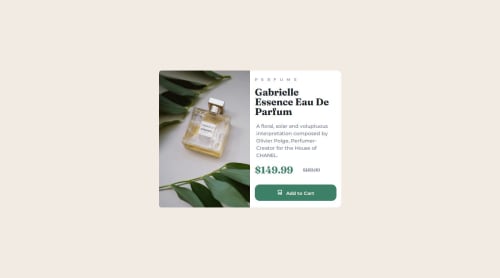
Responsive product preview card

Solution retrospective
I am really glad that I think the design is properly responsive, as I'm still getting comfortable with responsive design elements. I was able to successfully use the grid system with media queries along with the clamp() for font sizing.
What challenges did you encounter, and how did you overcome them?Initially I had chosen to use flexbox for the responsive design, but found it difficult to create the component correctly according to the design. The design was responsive but I was having difficulty getting the correct sizing for the larger screens. Using the grid system I was able to better halve the card for the image and product info.
What specific areas of your project would you like help with?I would really like feedback on whether the solution correctly implements responsive design, particularly whether my font sizing is good practice using the clamp function. Any tips on better practice would be greatly appreciated.
Please log in to post a comment
Log in with GitHubCommunity feedback
No feedback yet. Be the first to give feedback on Ian Parker's solution.
Join our Discord community
Join thousands of Frontend Mentor community members taking the challenges, sharing resources, helping each other, and chatting about all things front-end!
Join our Discord