


@correlucas
Posted
👾Hello @Kiranchai, Congratulations on completing this challenge!
Your solution its almost done and I’ve some tips to help you to improve it:
I saw that you’ve used flexbox to place the content and create the layout.
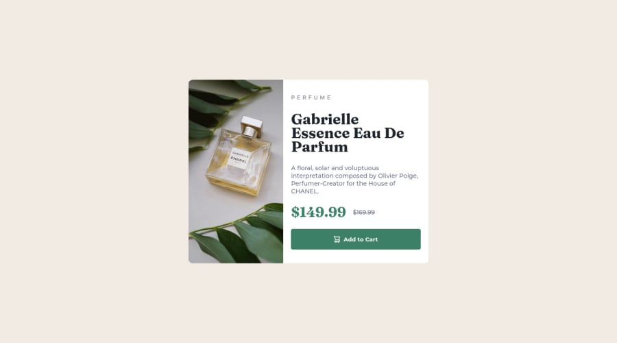
I think the best way to build this component with two columns is by using GRID LAYOUT since it is simpler to manage the columns and then create the media query for mobile. Here’s the steps to create it with grid create the main block to hold all the content (you can use <main> to wrap), set its width as max-width: 900px (it's the container size) and display: grid / grid-template-column: 1fr 1fr(this means that your component will have two columns with 50% of the container width each thats 450px). To manage the column with the text use flexbox and gap to give it the spacing between the texts or use padding-bottom to separate them.
Then to create the mobile version, all you need to do is to change the container flow vertically with grid-template-column: 1fr.
The image is not responsive yet, a quick way to make any image responsive and respecting the container size is to add display: block and max-width: 100% to the <img> selector. To improve the responsiveness even more adding the auto-crop property you can add object-fit: cover to make the image crop inside the container its inside.
img {
    display: block;
    object-fit: cover;
    max-width: 100%;
}
✌️ I hope this helps you and happy coding!
Marked as helpful
