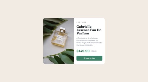
Responsive Product Preview Card

Solution retrospective
This exercise was great to learn how to use media queries better, the flex-shrink functionality and different images for different sizes.
What challenges did you encounter, and how did you overcome them?My biggest challenge was around the mobile image. I need to get better at this. I feel like I "hacked" my way through it but I'll go back to it and fix it by Monday.
I also had issues with the padding between elements. This is something that I also had to work around (adding specific padding for each element).
What specific areas of your project would you like help with?If someone could please review the code and offer any suggestions, that would be great, especially around the image structure and spacing.
Please log in to post a comment
Log in with GitHubCommunity feedback
No feedback yet. Be the first to give feedback on Davisnz's solution.
Join our Discord community
Join thousands of Frontend Mentor community members taking the challenges, sharing resources, helping each other, and chatting about all things front-end!
Join our Discord