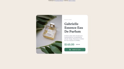
Responsive product preview card component

Solution retrospective
I am not really satisfied with the website responsiveness. I was also not able to move the image down a bit.
Some advice would be very helpful. Thanks so much for your help.
Please log in to post a comment
Log in with GitHubCommunity feedback
- @Yavanha
Hello,
first of all congratulations for the challenge.
I looked at your code and it seems to me that you started with the desktop version before the mobile version. When doing so it's hard to maintain your code for example:
Instead:

@media (max-width: 375px) {
.container {
  display: block ;
}

}
.container {
  display : flex ;
}
}

do this:

@media (min-width: 376px) {
    .container {
        display: flex ;
     }
}
The second solution allows you to use the default values of the div ( display: block) and add the complexity in the media query and most importantly avoid rewriting your properties that you have declared.
Also avoid using fixed values for width and height.
Finally, use the right properties for the right job:
transform is not used to center your container.
Hopefully this will help you a little.
Good luck

Join our Discord community
Join thousands of Frontend Mentor community members taking the challenges, sharing resources, helping each other, and chatting about all things front-end!
Join our Discord