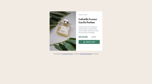
Responsive product preview card component using css grid

Solution retrospective
I use grid for the whole lay out and flex for the positioning. I struggle a bit with media query but I managed to pull it off.
Please log in to post a comment
Log in with GitHubCommunity feedback
- @mubizzy
Excellent job on this challenge! your report has a few issues though:
-
wrap everything in your body in
<main>or use semantics -
it is a best practice to use both HTML 5 and ARIA landmarks to ensure all content is contained within a navigational region.
Hope it helps:)...don't forget to mark it as helpful 👍
Marked as helpful -
- P@LucianoDLima
Good job on completing this challenge!
Instead of using
padding-top: 100px;on your<body>, you could remove the padding, then add the following to center your project in all screen sizes:display:flex;flex-direction: column;justify-content: center;//This will center vertically because you changed the flex-direction to column instead of the default value rowheight: 100vh;//You need this for the justify content to work here.Marked as helpful - @AdamMzkr
Nice solution but, it's some bugs in report check this and fix. Change div <attribution> for <footer> for example:)
Marked as helpful


Join our Discord community
Join thousands of Frontend Mentor community members taking the challenges, sharing resources, helping each other, and chatting about all things front-end!
Join our Discord