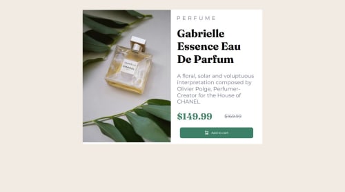
Responsive Product-preview-card component using flexbox

Solution retrospective
Mobile first workflow has always been something i have been looking forward to try out and i am proud of how i eventually give it a go in this project and the only thing i will look to do differently is next time is probably still consider the mobile-first approach.
What challenges did you encounter, and how did you overcome them?This project was my first time having to work with different image sizes for mobile and desktop version respectively and i overcome it by making research on the internet to eventually find out about the picture element which allows the browser to choose the most appropriate image based on the screen width.
Please log in to post a comment
Log in with GitHubCommunity feedback
- @MargaritaAlex
You did an awesome job here! And should be proud of it. The proportions are slightly off but hey I made the same mistake :D

Join our Discord community
Join thousands of Frontend Mentor community members taking the challenges, sharing resources, helping each other, and chatting about all things front-end!
Join our Discord