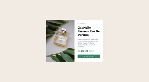
Responsive product preview card component using html and css

Please log in to post a comment
Log in with GitHubCommunity feedback
- @FrancoMinati
👾Hello @the0xtobi, Nice job! I left you a recommendation that @correlucas made me in the same challenge
Use the THE PICTURE TAG that is a shortcut to deal with the multiple images in this challenge. So you can use the <picture> tag instead of importing this as an <img> or using a div with background-image. Use it to place the images and make the change between mobile and desktop, instead of using a div or img and set the change in the css with display: none with the tag picture is more practical and easy. Note that for SEO / search engine reasons isn’t a better practice import this product image with CSS since this will make it harder to the image. Manage both images inside the <picture> tag and use the html to code to set when the images should change setting the device max-width depending of the device desktop + mobile.
Check the link for the official documentation for <picture> in W3 SCHOOLS: https://www.w3schools.com/tags/tag_picture.asp
See the example below:
<picture> <source media="(max-width:650px)" srcset="./images/image-product-mobile.jpg"> <img src="./images/image-product-desktop.jpg" alt="Gabrielle Parfum" style="width:auto;"> </picture>✌️ I hope this helps you and happy coding!

Join our Discord community
Join thousands of Frontend Mentor community members taking the challenges, sharing resources, helping each other, and chatting about all things front-end!
Join our Discord