Skip to content
  • Unlock Pro
  • Log in with GitHub
Solution
Submitted 12 months ago

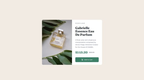
Responsive product preview card component using HTML/CSS

Ahmed•80
@Ahmed-l2
A solution to the Product preview card component challenge
View live sitePreview (opens in new tab)View codeCode (opens in new tab)

Solution retrospective


What are you most proud of, and what would you do differently next time?

Responsive design was a new concept to me, and I'm very proud of building my first responsive website.

What challenges did you encounter, and how did you overcome them?

I think this was my most challenging one yet because I was introduce to a new concept that I was not aware of before hand that is creating a responsive design that works with both PC and Mobile screens. I took a mobile first approach for this project and getting things to scale just right was new to me so it took me some time to get the hang of it but I have definitely improved by a lot and now have a better understanding of creating web pages that function on different screen sizes.

What specific areas of your project would you like help with?

I'm still fairly new to responsive designs so any feedback on my code would be greatly appreciated.

Code
Select a file

Please log in to post a comment

Log in with GitHub

Community feedback

  • P
    Daniel 🛸•44,740
    @danielmrz-dev
    Posted 12 months ago

    Hello there!

    Congrats on completing the challenge! ✅

    Your project looks great!

    I have a suggestion about your code that might interest you:

    📌 You can use the <picture> tag when you have different versions of the same image.

    Using the <picture> tag will help load the correct image to the user's device, saving bandwidth and improving performance.

    Example:

    <picture>
        <source media="(min-width: 768px)" srcset="{desktop image path here}">
        <img src="{mobile image path here}" alt="{alternative text here}">
    </picture>
    

    I hope this helps!

    Other than that, excellent work!

    Marked as helpful
  • appleseed9•160
    @appleseed9
    Posted 12 months ago

    Hi, very good job achieving pixel perfection.

    It is recommended for line-height not to use units because of the peculiar way they calculate.

    Marked as helpful
  • Munib ahmad•270
    @MunibAhmad-dev
    Posted 12 months ago

    Great job on completing your first responsive website!

    It's impressive to see how you've tackled the challenge of responsive design head-on, especially since it was a new concept for you. Here are some points I'd like to highlight:

    What You Did Well: Mobile-First Approach: Adopting a mobile-first strategy is a smart move. It ensures that the core functionality of your site is accessible on smaller screens before scaling up for larger ones. This approach is often recommended in modern web development. Responsive Design: Successfully creating a website that works well on both PC and mobile screens is a significant achievement. It shows your adaptability and willingness to learn new concepts. Perseverance: Overcoming the initial challenges and steadily improving your understanding of responsive design is commendable. This persistence is crucial in web development. Suggestions for Improvement: Code Optimization: Review your CSS for any redundancies or repetitive styles. Using CSS preprocessors like SASS can help streamline your code and make it more maintainable. Media Queries: Ensure that your media queries cover a wide range of devices. Sometimes, additional breakpoints may be necessary to cater to tablets or larger monitors. Flexible Layouts: Consider using relative units like percentages, ems, or rems instead of fixed pixels. This can make your design more adaptable to various screen sizes. Areas to Focus On: Testing Across Devices: Regularly test your site on different devices and browsers. Tools like BrowserStack or real device testing can provide insights into how your site performs across different environments. Performance Optimization: Responsive design can sometimes lead to larger file sizes. Optimize your images and use techniques like lazy loading to improve load times. Accessibility: Ensure that your design is not only responsive but also accessible. Use semantic HTML, provide alt text for images, and ensure that your site is navigable via keyboard.

    Marked as helpful
  • P
    Xqgoji•120
    @JhinDanzo
    Posted 12 months ago

    good job!

Join our Discord community

Join thousands of Frontend Mentor community members taking the challenges, sharing resources, helping each other, and chatting about all things front-end!

Join our Discord
Frontend Mentor logo

Stay up to datewith new challenges, featured solutions, selected articles, and our latest news

Frontend Mentor

  • Unlock Pro
  • Contact us
  • FAQs
  • Become a partner

Explore

  • Learning paths
  • Challenges
  • Solutions
  • Articles

Community

  • Discord
  • Guidelines

For companies

  • Hire developers
  • Train developers
© Frontend Mentor 2019 - 2025
  • Terms
  • Cookie Policy
  • Privacy Policy
  • License

Oops! 😬

You need to be logged in before you can do that.

Log in with GitHub

Oops! 😬

You need to be logged in before you can do that.

Log in with GitHub

How does the accessibility report work?

When a solution is submitted, we use axe-core to run an automated audit of your code.

This picks out common accessibility issues like not using semantic HTML and not having proper heading hierarchies, among others.

This automated audit is fairly surface level, so we encourage to you review the project and code in more detail with accessibility best practices in mind.

How does the CSS report work?

When a solution is submitted, we use stylelint to run an automated check on the CSS code.

We've added some of our own linting rules based on recommended best practices. These rules are prefixed with frontend-mentor/ which you'll see at the top of each issue in the report.

The report will audit 1st-party linked stylesheets, and styles within <style> tags.

How does the HTML validation report work?

When a solution is submitted, we use html-validate to run an automated check on the HTML code.

The report picks out common HTML issues such as not using headings within section elements and incorrect nesting of elements, among others.

Note that the report can pick up “invalid” attributes, which some frameworks automatically add to the HTML. These attributes are crucial for how the frameworks function, although they’re technically not valid HTML. As such, some projects can show up with many HTML validation errors, which are benign and are a necessary part of the framework.

Oops! 😬

You need to be logged in before you can do that.

Log in with GitHub

Oops! 😬

You need to be logged in before you can do that.

Log in with GitHub

Oops! 😬

You need to be logged in before you can do that.

Log in with GitHub

Oops! 😬

You need to be logged in before you can do that.

Log in with GitHub