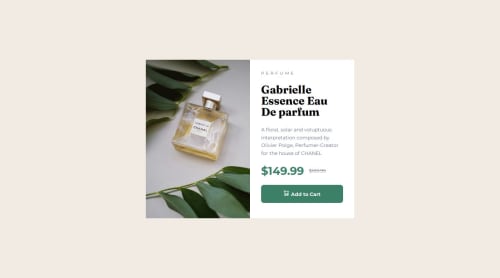
Responsive product preview card component

Solution retrospective
I am proud that i successfully applied media queries to my mobile first design in order to create a responsive design that adapted to different screen sizes(mobile, tablet and desktop). It was seamless and cohesive.
What challenges did you encounter, and how did you overcome them?I struggled with applying styles to my image using the <source> element. I fixed that by googling how to style different images for different screen sizes on the same design and that worked.
What specific areas of your project would you like help with?I would like to know how to apply border radius on my container. i tried doing that but its not showing on my design. I dont know why that is happening.
Please log in to post a comment
Log in with GitHubCommunity feedback
No feedback yet. Be the first to give feedback on Fatima S's solution.
Join our Discord community
Join thousands of Frontend Mentor community members taking the challenges, sharing resources, helping each other, and chatting about all things front-end!
Join our Discord