Responsive product preview card

Solution retrospective
Should I be hardcoding the widths?
Please log in to post a comment
Log in with GitHubCommunity feedback
- @grace-snow
Well done on this solution, it looks pretty good! Only a few notes from me:
- this is hitting all sides of my screen at the moment. Give the body or main a little padding in px so that can't happen.
- Give this article a label as already explained in response to another comment. You can use aria-labelledby in this instance refencing the unique ID of the heading (product name) or use aria-label.
- As already said in a separate comment, this should have a lower importance heading level like h2 instead of h1. I've written a post about headings in html that you may find beneficial: https://fedmentor.dev/posts/heading-order/
- try to never have text in divs or spans alone. Pop those prices in a paragraph instead of div.
- the icon inside the button must have an empty alt. This is important to understand when an image is decorative. Currently the img alt is changing the accessible name of the button (in a bad way!)
- The product description should provide the same meaning as the image does, it mustn't just repeat the name of the product that's already in the text. Look up Craig Abbot's blog post about how and when to write alt text on images.
Marked as helpful - @hitmorecode
Congratulations looks really good. The answer to your question is yes. Most of the times hard coding the width and height of a card is the way to go. I do have a few tips.
- When working with different images for different screen sizes the way to go is by using the picture element. These videos srcset and picture element explains really well how it works and what it does.
- I would change the
h2to apand keep theh1as it is. - As for the price, change the 2nd
spanto<s></s>
I hope you find this helpful. Keep it up 👍👌
Marked as helpful - @skyv26
Hi @joshcesana,
Firstly, fantastic work! 🌟 I loved how you used
max-widthfor responsive design until 768px and transitioned smoothly. It's a thoughtful touch for ensuring adaptability.However, here are a few suggestions for improvement to make your code even more robust:
1️⃣ Use the
mainTag
Since the card is the main content of your webpage, wrapping it with a<main>tag will make it more semantic and accessible.2️⃣ Follow Proper Heading Hierarchy
I noticed you used<h2>before<h1>. While this might seem fine visually, it can harm SEO and accessibility. You can control the font size with CSS instead of breaking the hierarchy. For example:h1 { font-size: 1.5rem; }3️⃣ Leverage Semantic Tags
Instead of using<div>for independent content like your card, wrap it with an<article>tag. It improves readability and semantics, especially for content that represents a standalone entity.
Improved Code 🛠️
Here’s your updated code with these suggestions incorporated:
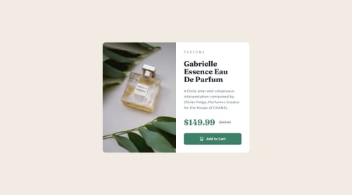
---
import ProductDesktopImage from "../images/image-product-desktop.jpg"
import ProductMobileImage from "../images/image-product-mobile.jpg"
import { Image } from "astro:assets"
---

<main>
  <article class="flex max-w-[21.438rem] flex-col overflow-hidden rounded-xl bg-white md:max-w-[37.5rem] md:flex-row">
      <!-- Image Section -->
      <div class="md:w-1/2">
          <Image src={ProductDesktopImage} width="300" height="450" format="avif" loading="eager" alt="Gabrielle Essence Eau De Parfum" class="hidden h-full w-full object-cover md:block" />
          <Image src={ProductMobileImage} width="343" height="240" format="avif" loading="eager" alt="Gabrielle Essence Eau De Parfum" class="h-auto w-full object-cover md:hidden" />
      </div>

      <!-- Content Section -->
      <div class="p-6 md:w-1/2 md:p-8">
<h1 class="mb-3 text-xs font-medium uppercase tracking-[5px] text-gray-blue md:mb-6">Perfume</h1>
          <h2 class="mb-4 text-balance font-fraunces text-[2rem] font-bold leading-8 text-dark-blue md:mb-5 md:text-3xl md:leading-8">Gabrielle Essence Eau De Parfum</h2>
          <p class="text-dark-gray-blue mb-8 font-montserrat text-sm font-medium leading-[1.4375rem] text-gray-blue md:mb-6">
              A floral, solar and voluptuous interpretation composed by Olivier Polge, Perfumer-Creator for the House of CHANEL.
          </p>
          <div class="mb-5 flex items-center">
              <span class="font-fraunces text-[2rem] font-bold text-dark-cyan">$149.99</span>
              <span class="text-dark-gray-blue ml-4 font-montserrat text-[0.8125rem] text-gray-blue line-through"> $169.99 </span>
          </div>
          <button
              class="flex w-full items-center justify-center rounded-lg bg-dark-cyan py-3.5 text-sm font-bold text-white hover:bg-very-dark-cyan"
          >
              <img src="/icon-cart.svg" width="27" height="16" alt="Shopping cart icon" class="pr-3"/>
              Add to Cart
          </button>
      </div>
  </article>
</main>
Summary of Changes:
- ✅ Added
<main>to wrap the card as the primary content. - ✅ Used
<article>to replace<div>for better semantics. - ✅ Fixed heading hierarchy, moving
<h1>before<h2>and controlled the font size with CSS.
Great job overall, and I’m excited to see your future iterations! 😊 Let me know if you need any further assistance.
If you are still not convinced about heading hierarchy and the font size then, just think about tailwind default font sizes for the h1-h6 heading and why they did it ?
Cheers,
Aakash 🚀Marked as helpful - ✅ Added
- @skyv26
Hi @grace-snow,
Thank you for sharing your thoughts! 😊 In the context of this project—a single, standalone card demo—the use of
<article>is indeed appropriate since the card is a self-contained piece of content. While adding anaria-labelto the<article>could enhance accessibility, it isn't strictly required in this case.Additionally, using
<h1>works well for an isolated component like this, as it doesn’t need to fit into a larger page hierarchy. This approach aligns with W3C standards and best practices for semantic HTML.I appreciate the discussion and look forward to your thoughts!
Best regards


Join our Discord community
Join thousands of Frontend Mentor community members taking the challenges, sharing resources, helping each other, and chatting about all things front-end!
Join our Discord