Submitted almost 3 years agoA solution to the Product preview card component challenge
Responsive Product Preview Card
sass/scss, vite

@wozdog
Solution retrospective
All feedback welcome.
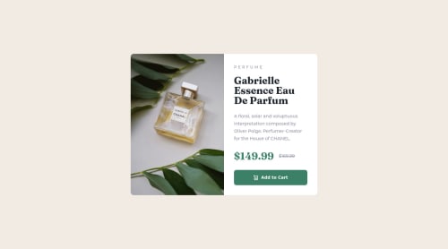
I had some trouble with the responsive images. You will see in the desktop screenshot the white space under the button. This is the image pushing down the grid. I tried adding the images in CSS using background images, but that came with its own complications. I'm keen to see how others have done it.
All in all, it was a very time-consuming process for something so simple. I'm looking forward to speeding up a bit with practice. Thank you for your time.
Code
Please log in to post a comment
Log in with GitHubCommunity feedback
- @ferlagher
Hi, nice work with your solution!
Here are my recomendations:
- Add to the body
min-height: 100vh,display: flexandalign-items: center, for center your card. - The wite space under the button it's because the content has too much horizontal space and can't wrap. In the
.contentclass, make the padding bigger (3rem) so the content fills the container vertically and it matches the design.
Hope it was helpfull!
- Add to the body

Join our Discord community
Join thousands of Frontend Mentor community members taking the challenges, sharing resources, helping each other, and chatting about all things front-end!
Join our Discord