


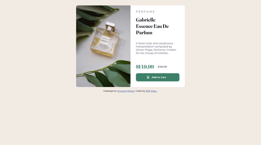

@correlucas
Posted
👾Hello Rim Sabia, congratulations for your solution!
Answering your question:
To manage the css properties for mobile screen there's no need to use !important all you need to do is create a media query and manage this changes inside this media query inserting what you want that gets activated when the device changes.
I can see that in your solution there's yet a media query applied but the mobile version isn't centered, I change a bit your code and I've aligned everything and cleaned some code, here's the changes I've applied:
body {
    min-height: 100vh;
    font-size: 14px;
    background-color: hsl(30, 38%, 92%);
    display: flex;
    /* align-items: center; */
    /* justify-content: center; */
    flex-direction: column;
}

div.card {
    display: grid;
    grid-template-columns: 1fr 1fr;
    /* grid-auto-columns: 1fr; */
    /* grid-template-areas: 'picture cardtext'; */
    max-width: 600px;
    /* height: 450px; */
    margin: auto;
    background-color: white;
    /* margin-top: 30px; */
    border-radius: 10px;
    box-shadow: 10px 10px 80px rgb(191 191 191);
    justify-items: center;
    align-items: center;
}
Hope it helps and happy coding!
@rimsahia
Posted
@correlucas thank you so much for your help, but actually I didn't master flexbox yet so I'm trying to practice grid first so if you can modify it a little bit please😊
