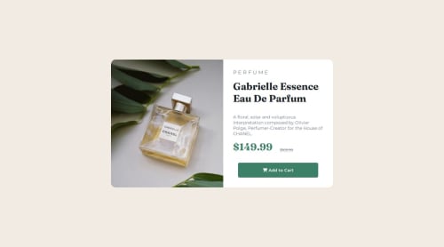
Responsive Product preview card using CSS Flex box

Solution retrospective
This project was actually more tasking that I thought it to be.I was able to complete it and I'm proud😊.
- This is the first Project I'm doing on my own on responsive designs(asides following tutorials).
- I was able to switch the two images for mobile and for desktop
- I was able to vertically align my work which was a real hassle for me before.
CHALLENGE I was faced with the challenge of switching between the mobile image and the desktop image. SOLUTION I placed my image in a div and then gave the div an ID of "my-image" and a class of "product-image". At the breakpoint I then changed the image using 'the background-image' property on the class and set the visibility of "my-image to hidden".
#my-image{
  visibility: hidden;
}
.product-img{
  border-radius: 15px 0 0 15px;
  background-image: url("images/image-product-desktop.jpg");
  background-size: cover;
}
Pls recommendations on a better way to do this.
What specific areas of your project would you like help with?I'd be really open to responses on these
- How to improve typography in responsive designs.
- better ways to switch between the images for mobile and desktop
- How to improve on my code , because I feel it was not clean enough.
Please log in to post a comment
Log in with GitHubCommunity feedback
No feedback yet. Be the first to give feedback on Mine's solution.
Join our Discord community
Join thousands of Frontend Mentor community members taking the challenges, sharing resources, helping each other, and chatting about all things front-end!
Join our Discord