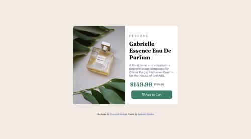
Not Found
Not Found
Not Found
Not Found
Not Found
Not Found
Not Found
Not Found
Not Found
Not Found
Not Found
Not Found
Not Found
Not Found
Not Found
Not Found
Not Found
Not Found
Not Found
Not Found

Submitted

Responsive product preview card using CSS Grid

Anthony Nanfito• 120

@ananfito

Desktop design screenshot for the Product preview card component coding challenge

This is a solution for...

  • HTML
  • CSS
1newbie
View challenge

Design comparison


SolutionDesign

Solution retrospective


I have a feeling my solution is not the most elegant when it comes to the CSS styling for the mobile design. I had to "tweek" a few things in the product div to get it to be the correct height and background color.

I would love any suggestions on how to get better at making mobile-friendly designs. I'm open to specific suggestions to this project or general resources. Thanks.

Community feedback

P
Grace• 27,650

@grace-snow

Posted

I agree with all of the above

I'd add

  • don't set width on the component. It's overflowing my screen. Instead only use max-width so it can shrink if it needs to
  • min height instead of height on the body. Same principle except this time you want the body to be able to get bigger if there's more content
  • for shorter code you can set border radius on the whole component and use overflow hidden so the corners of the img gets cropped. This is easier than setting individual corner radius on images at each breakpoint
  • button shouldn't have height or explicit width. Let it be display flex or inline flex and use padding instead of height
  • youre not using the picture element correctly here. Just as you should work mobile first in styling, do the same with picture and let mobile img be the default src on the img tag. Then you only need ONE source with a min width media query on it to make the switch for larger screens
  • capitalise text with text transform and create space with letter spacing, both in css not html
  • this must have a heading element for the name of the product
  • the old price should be wrapped in a del ele. Screenreaders are not told when text has a line through so you also need to add some visually hidden text in a span or pseudo element to inform those users that it's the old price (has been deleted)
  • if using an inline svg for the (decorative not meaningful) cart icon you must add aria-hidden="true" focusable="false"
  • make sure the component has a little margin so it can't hit screen edges (or its wrapping element has a little padding)
  • not essential but id recommend putting the attribution in a footer element outside of main

Marked as helpful

1

Anthony Nanfito• 120

@ananfito

Posted

@grace-snow Thanks for the additional suggestions. Adding them to my "to-do" list for project revisions. (-:

0
Nick Carlisi• 180

@nickcarlisi

Posted

Hey Anthony,

Good job!

For your comment about mobile friendly designs, it's highly recommended to use a mobile first approach and then add media queries to change things up at larger screen sizes when needed. If you go to youtube and search ''kevin powell mobile first', the first video that pops up is really helpful. That guy is a great CSS teacher in general.

Some things I noticed...

  • It looks like you used height in a lot of places when you really don't need it. You have a height on the container and the product image divs. In dev tools, I went in and removed all of the heights and everything looks pretty much the same. Often, you don't need to specify heights, you can let the content dictate the height.

  • I noticed you used flex-box more than necessary. I used to do this a lot. Once again, in dev tools, I removed display: flex (and other flex related properties) from .product-image and .product-description and things looked the same, so generally you can avoid writing excess code.

  • I noticed for the word perfume, you have it capitalized and you added extra spaces in the html. You should avoid manually adding spaces. Instead, in your CSS, you can use letter-spacing to control exactly how much space you want between each letter and you can use text-transform: uppercase to change the casing

  • Finally, you can avoid specifying grid-template-rows in this case. Since your grid container has only 2 children (.product-image and .product), when you set the grid-template-columns to 1fr, it automatically will add the second row.

I hope these suggestions help. Happy coding!

Marked as helpful

0

Anthony Nanfito• 120

@ananfito

Posted

@nickcarlisi Thanks so much for the suggestion about Kevin Powell. When I checked his channel he actually uploaded a tutorial for this exact project a few days ago. So I'll be taking a deep-dive into that and is other videos on mobile-first design. (-:

1
Lukasz-Milde• 150

@Lukasz-Milde

Posted

Hi! First of all, consider using CLASS instead of ID in HTML. If we talk about CSS and responsive designs, is good to use less PX as possible. Dive into EM, REM, and even %. One of my skilled friends told me to NOT set height if possible. Good Luck!

0

Please log in to post a comment

Log in with GitHub
Discord logo

Join our Discord community

Join thousands of Frontend Mentor community members taking the challenges, sharing resources, helping each other, and chatting about all things front-end!

Join our Discord